
Establishing Ncontracts' first Design System, Nstyle
TL;DR
✦ I established our Nstyle UI Kit out of the necessity to have one centralized place where we could see the common components and styles we were using for our net-new products.
✦ I worked alongside development to establish our first component library which we called "Common UI" (and eventually our Storybook library, Nstyle Components) between feature work efforts.
✦ I created "Decision Trees" to help designers and developers quickly find the answers they need to be able to make decisions for when to choose one component or pattern vs another.
"Every company has a design system, right?"
Coming from the world of graphic design where a company having some flavor of brand guidelines is commonplace, I, a naive junior product designer just starting out, surely thought this was the case.
After a few months of working on net-new feature work and struggling to keep up with the components we had created over time and what they looked like, I started rummaging through our different project files and collecting them to create our first version of our Nstyle UI Kit. I scheduled several meetings with the other designers over time until we felt we had captured the styling and patterns of what we saw as the most common components. From there we determined we could move on to diving deeper into documentation.
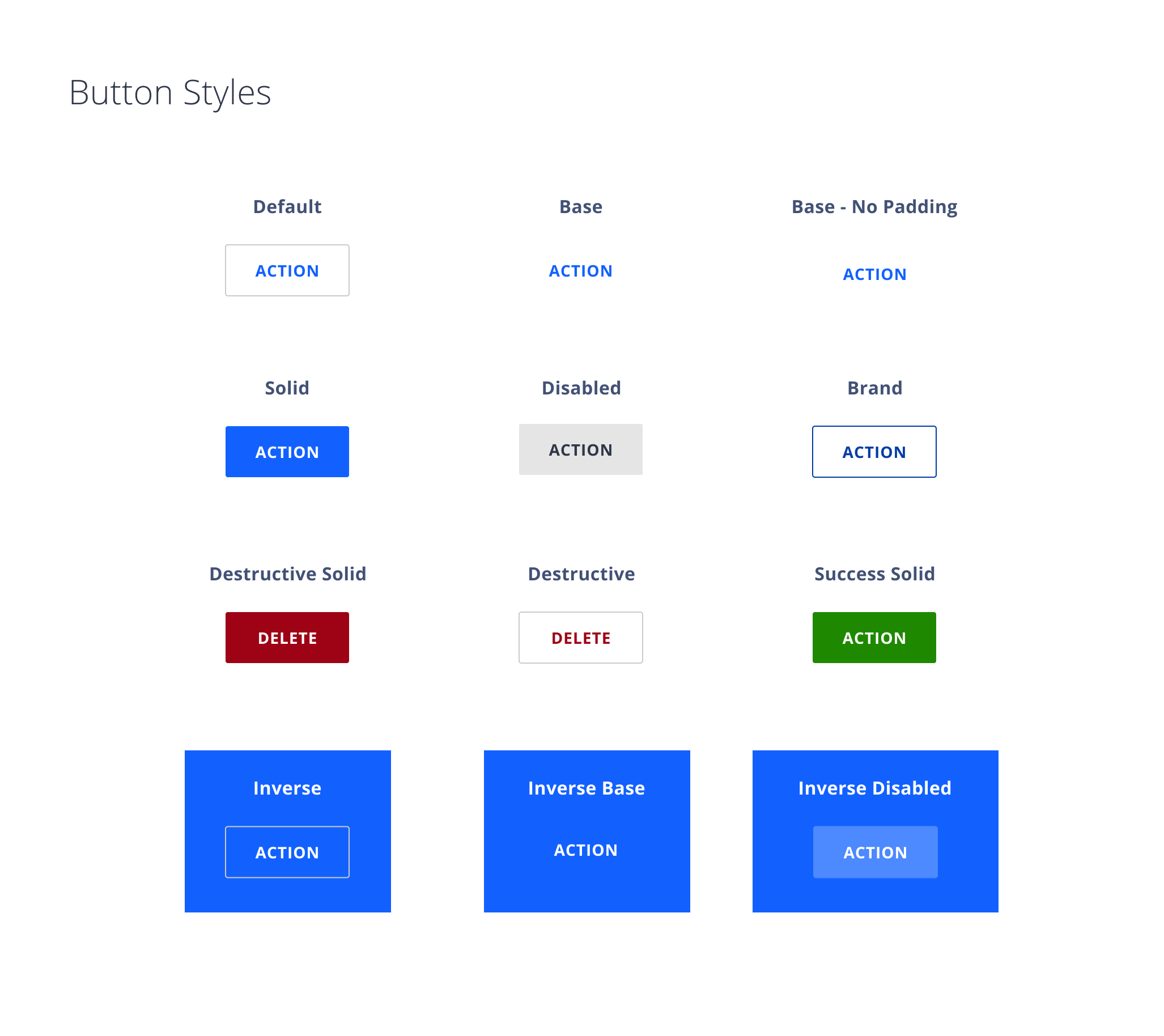
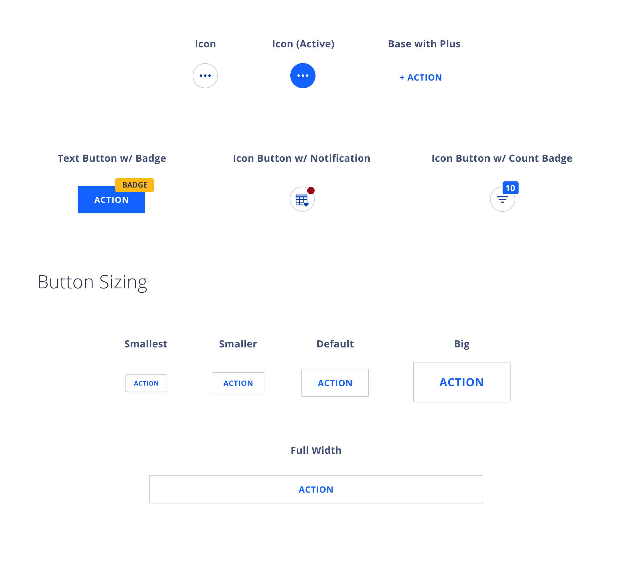
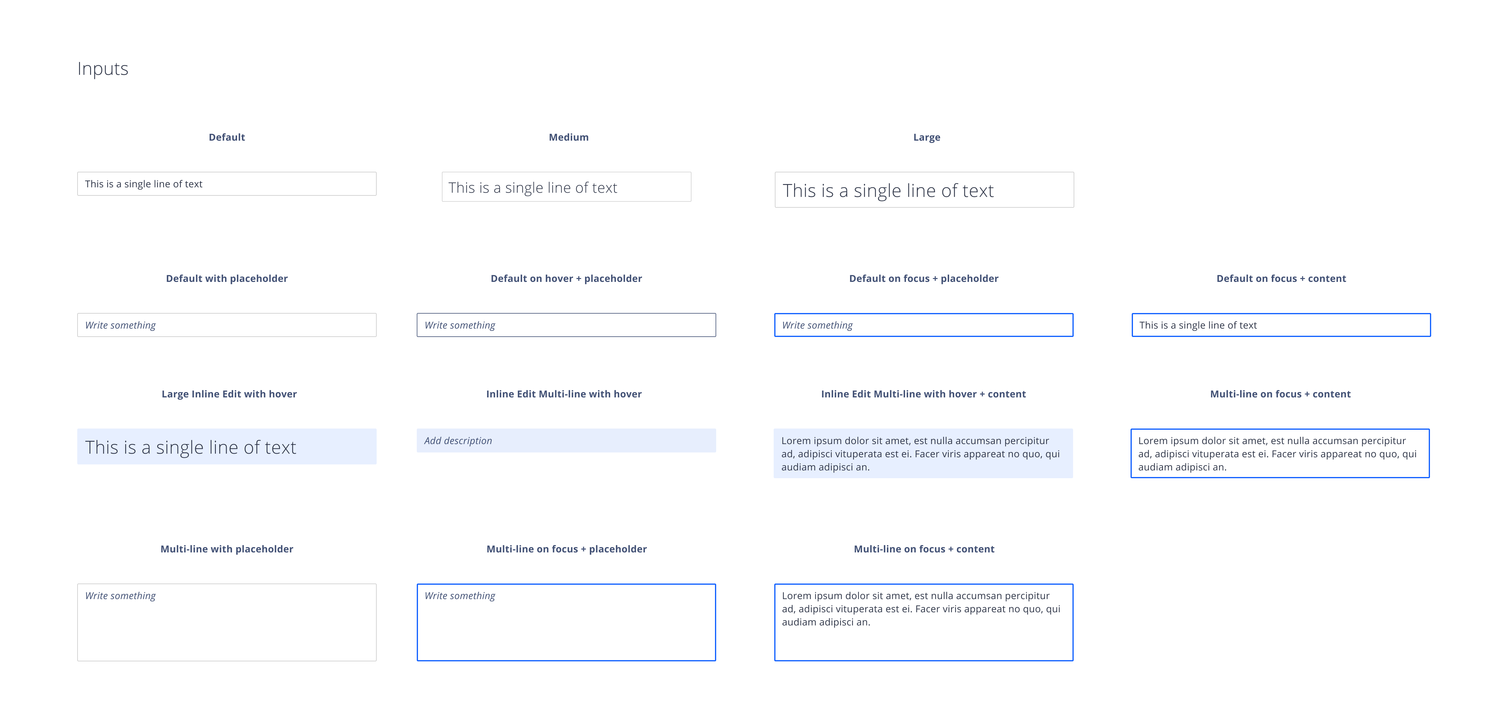
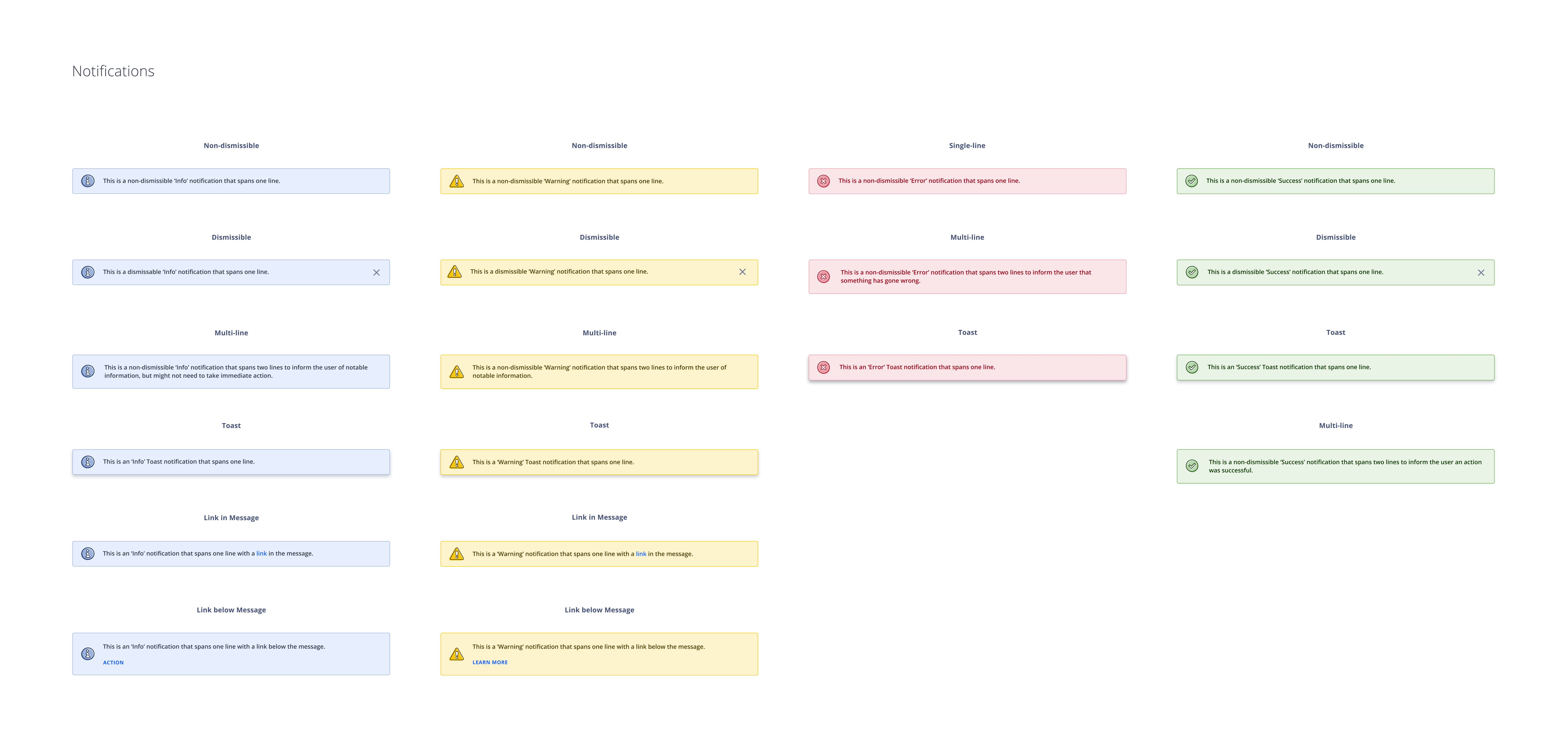
| A few excerpts from our Nstyle UI kit
| Component interaction design prototypes made with Axure RP

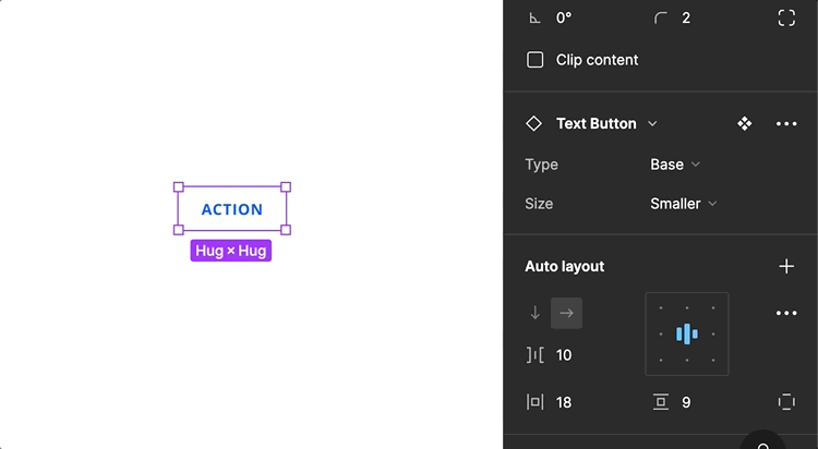
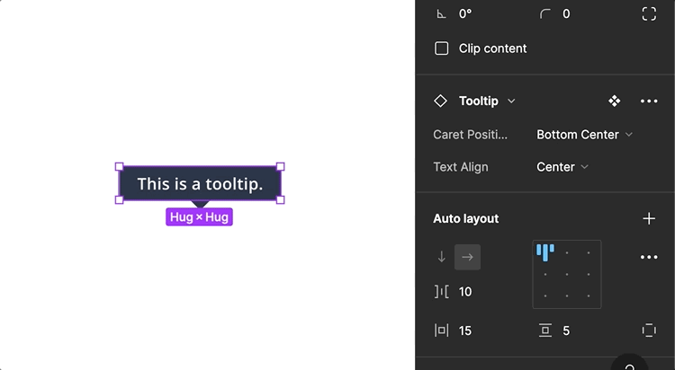
| Components with Figma Autolayout
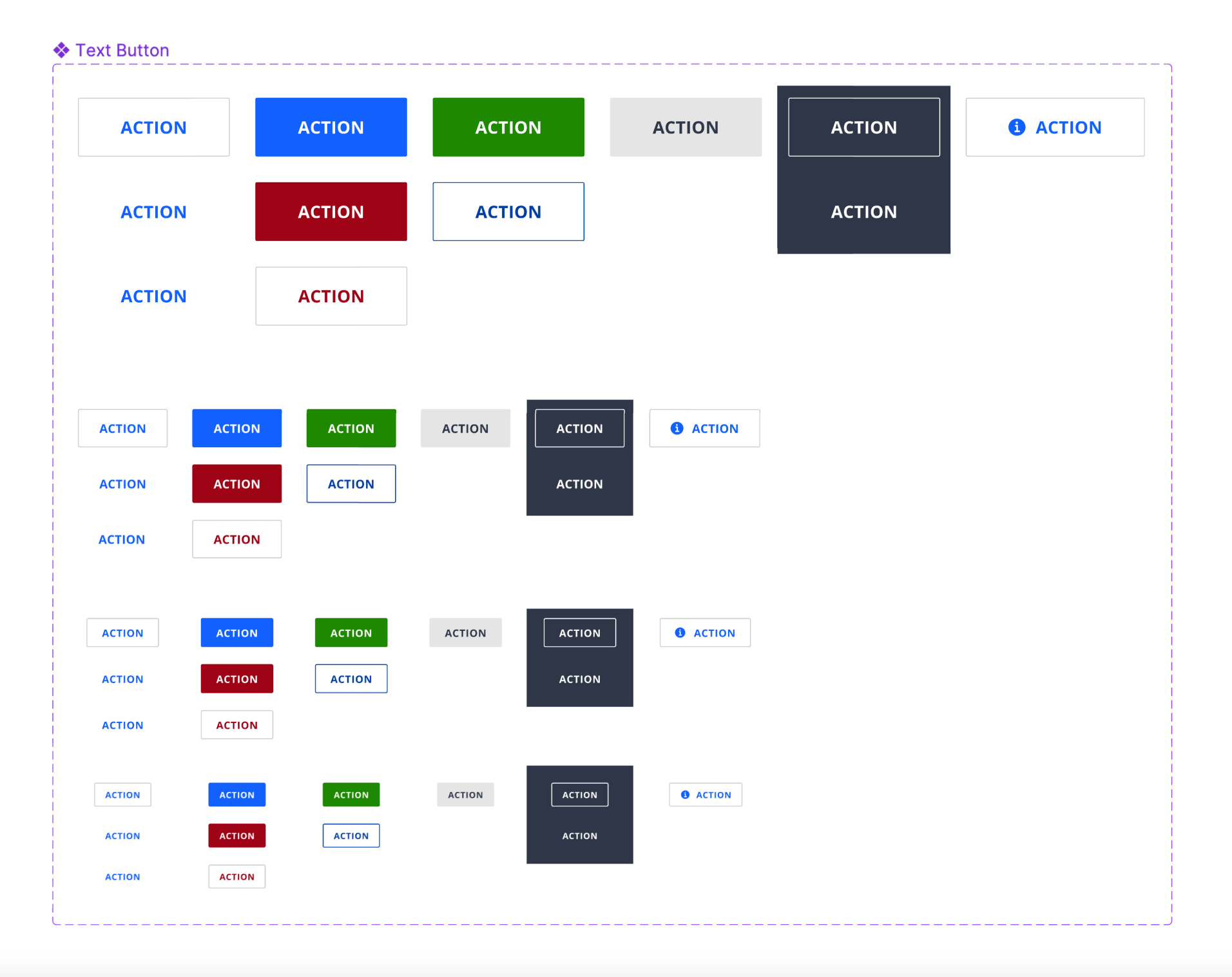
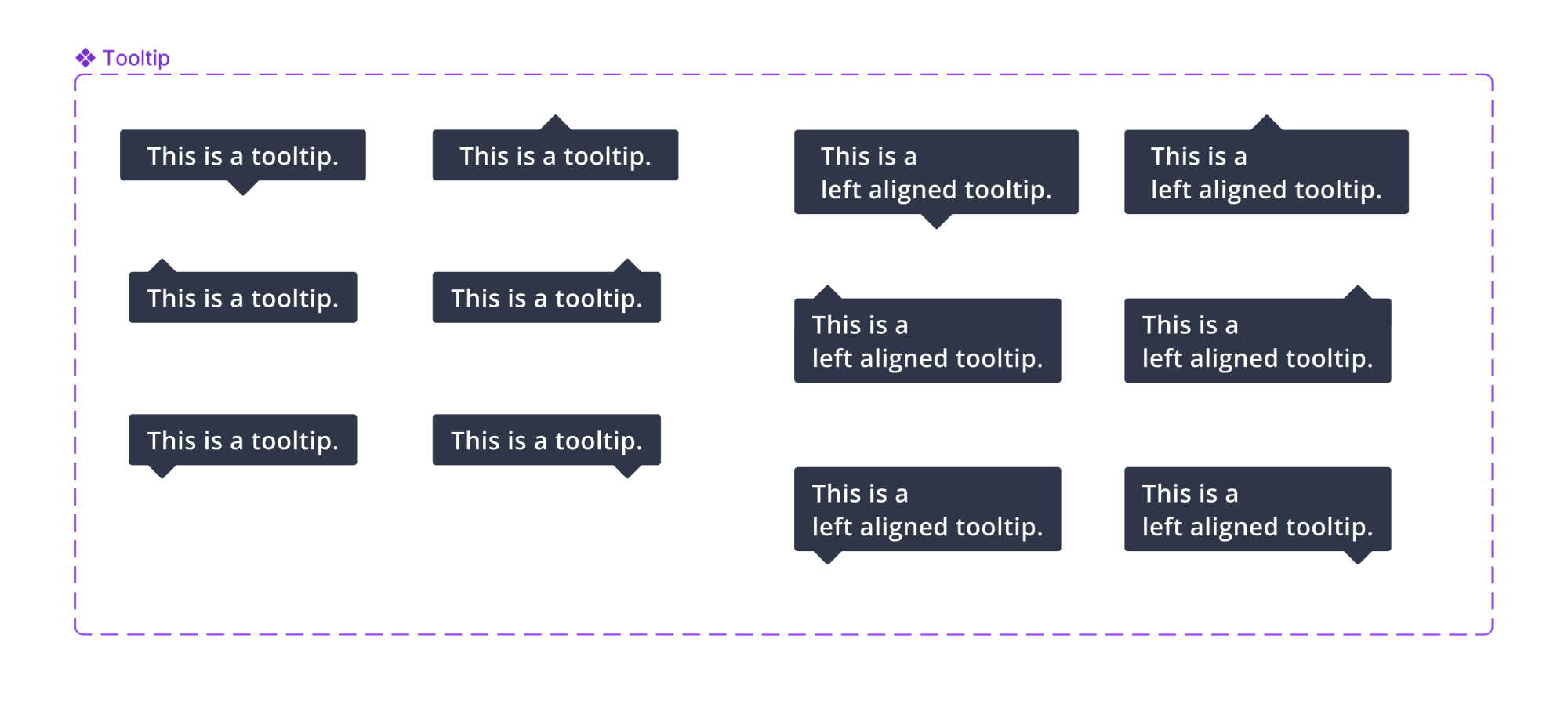
| Button + tooltip Figma variants
Next step: documentation!
Because I knew that there were plenty of resources for what it meant to create a great design system, I decided that researching further would help me learn what it meant to construct great design system documentation.
I took what I had learned and came up with a few common themes: anatomy, when to use, placement, specifications, and behavior. These turned out to be a solid starting point for furthering understanding of each component and finding the gaps where there wasn't as much clarity from the first round of shared understanding e.g. accessibility, responsiveness, and microinteractions.
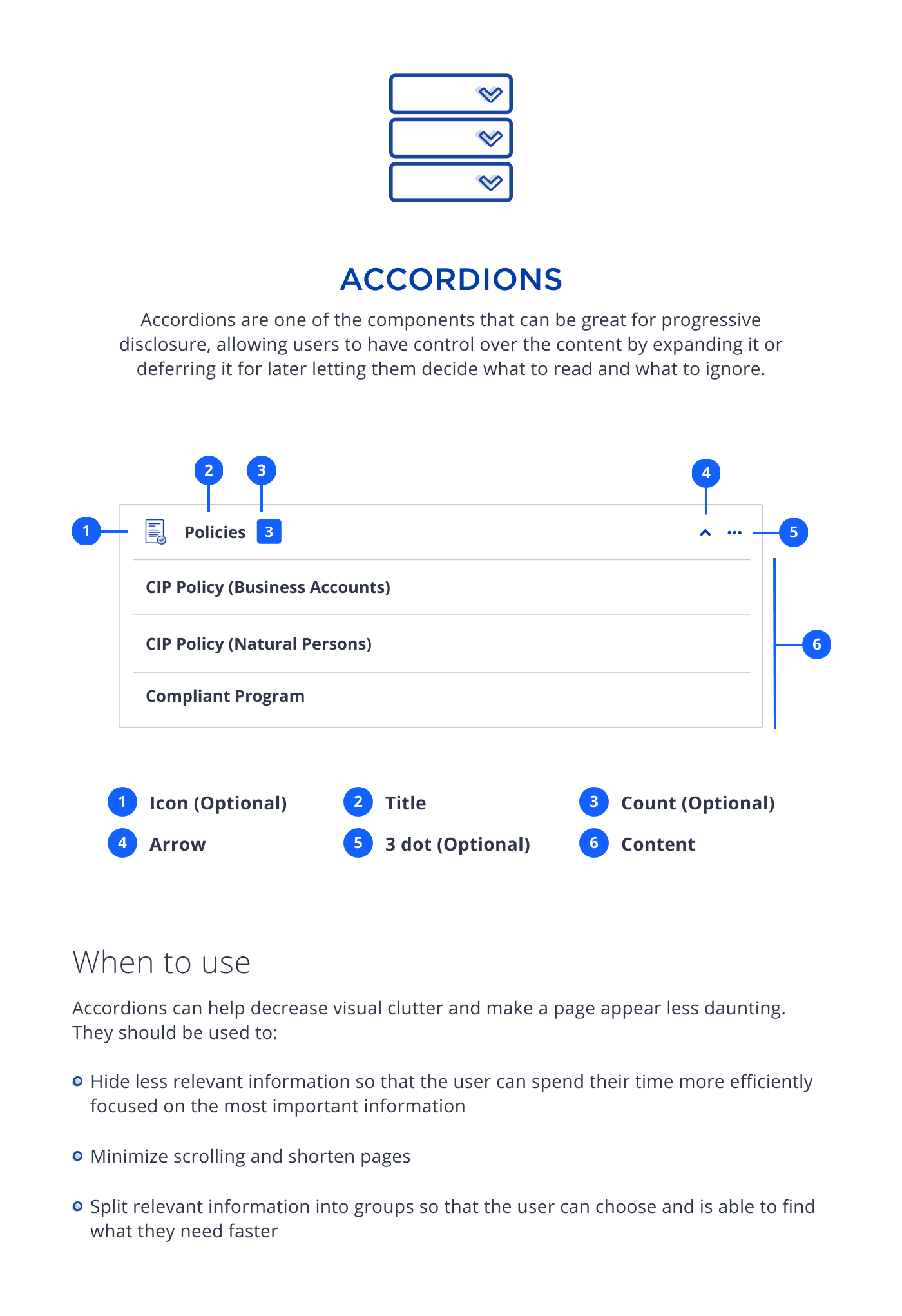
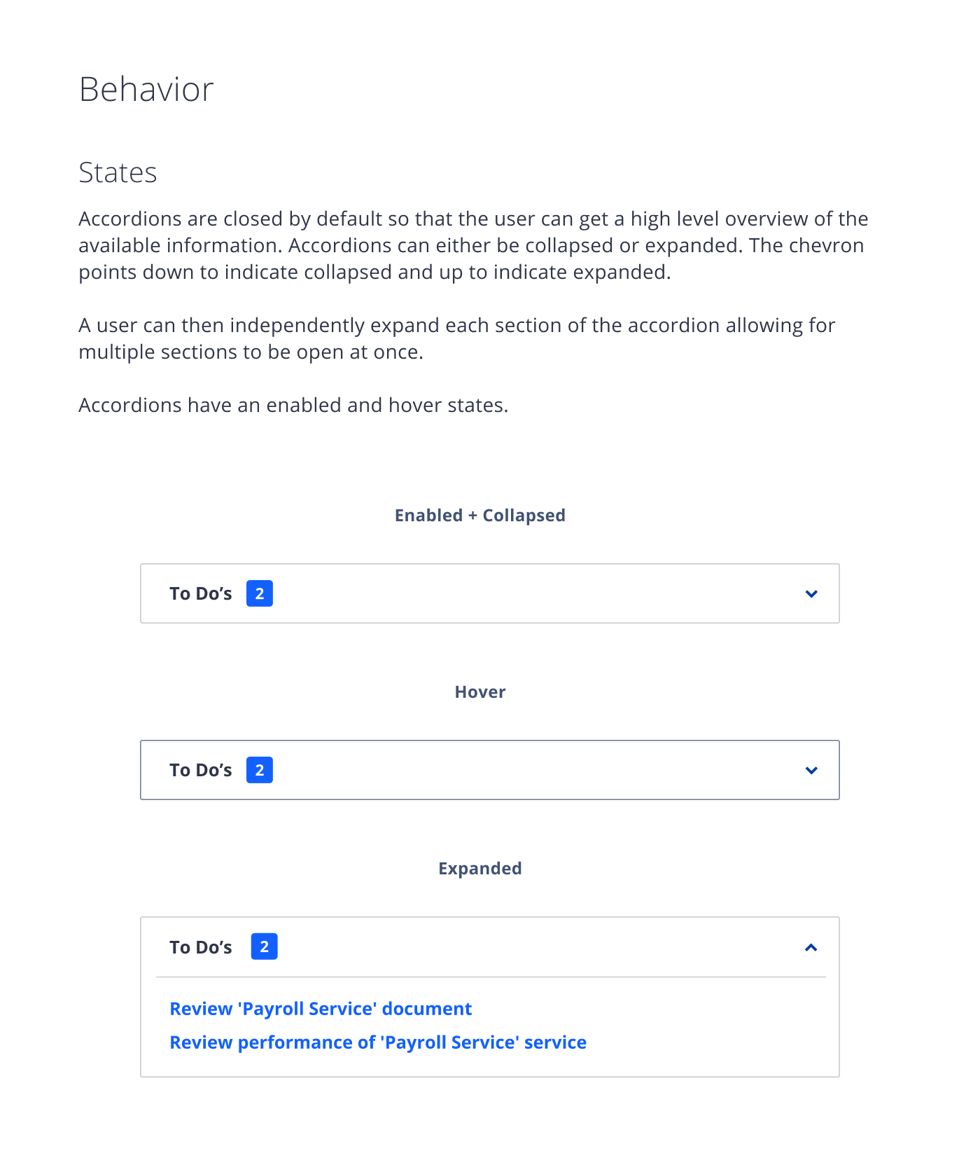
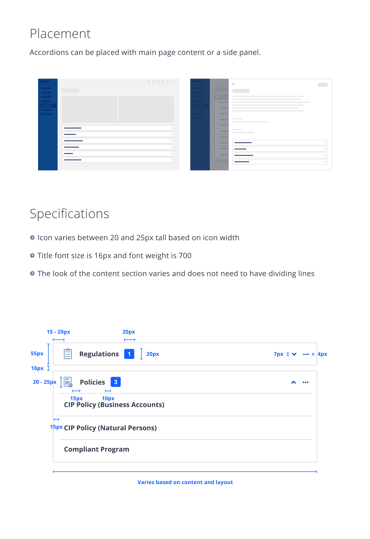
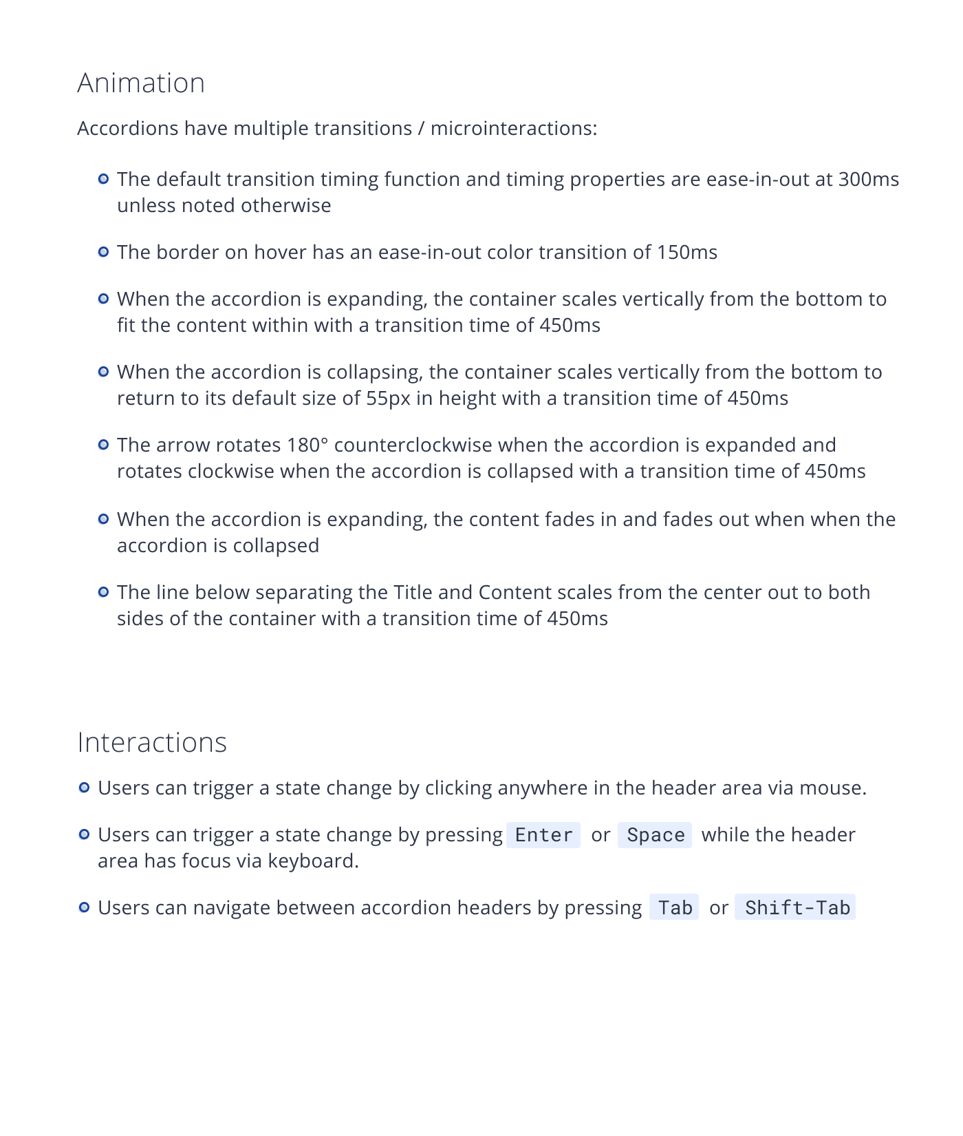
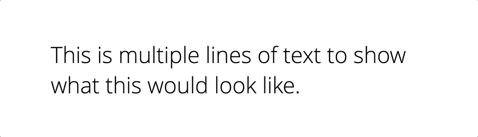
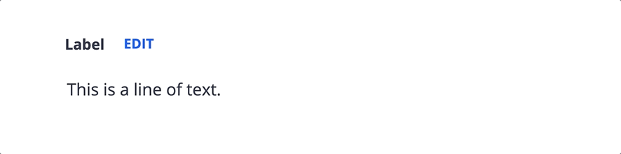
| My original attempt at documenting Accordions in Figma
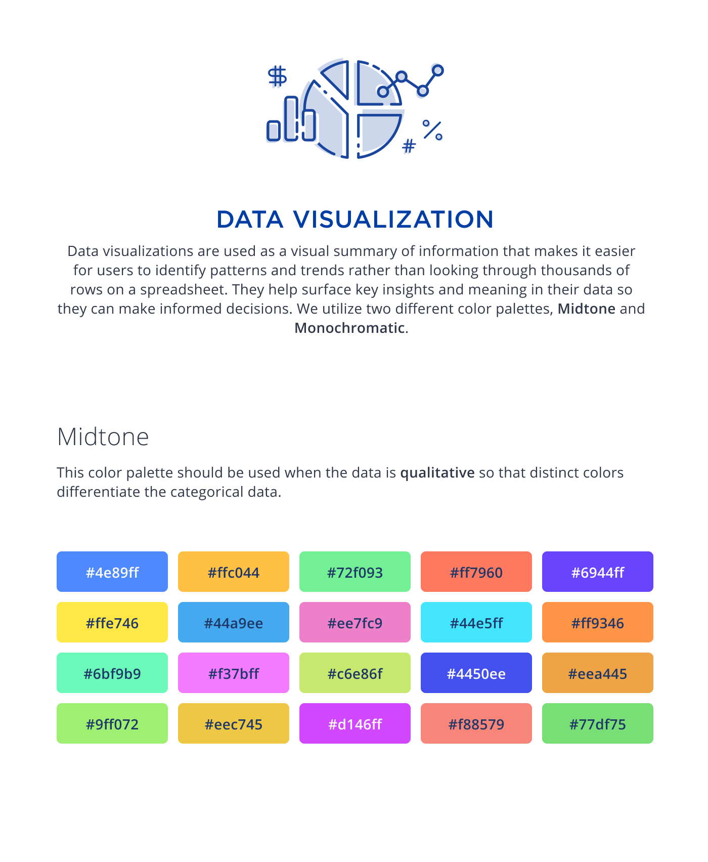
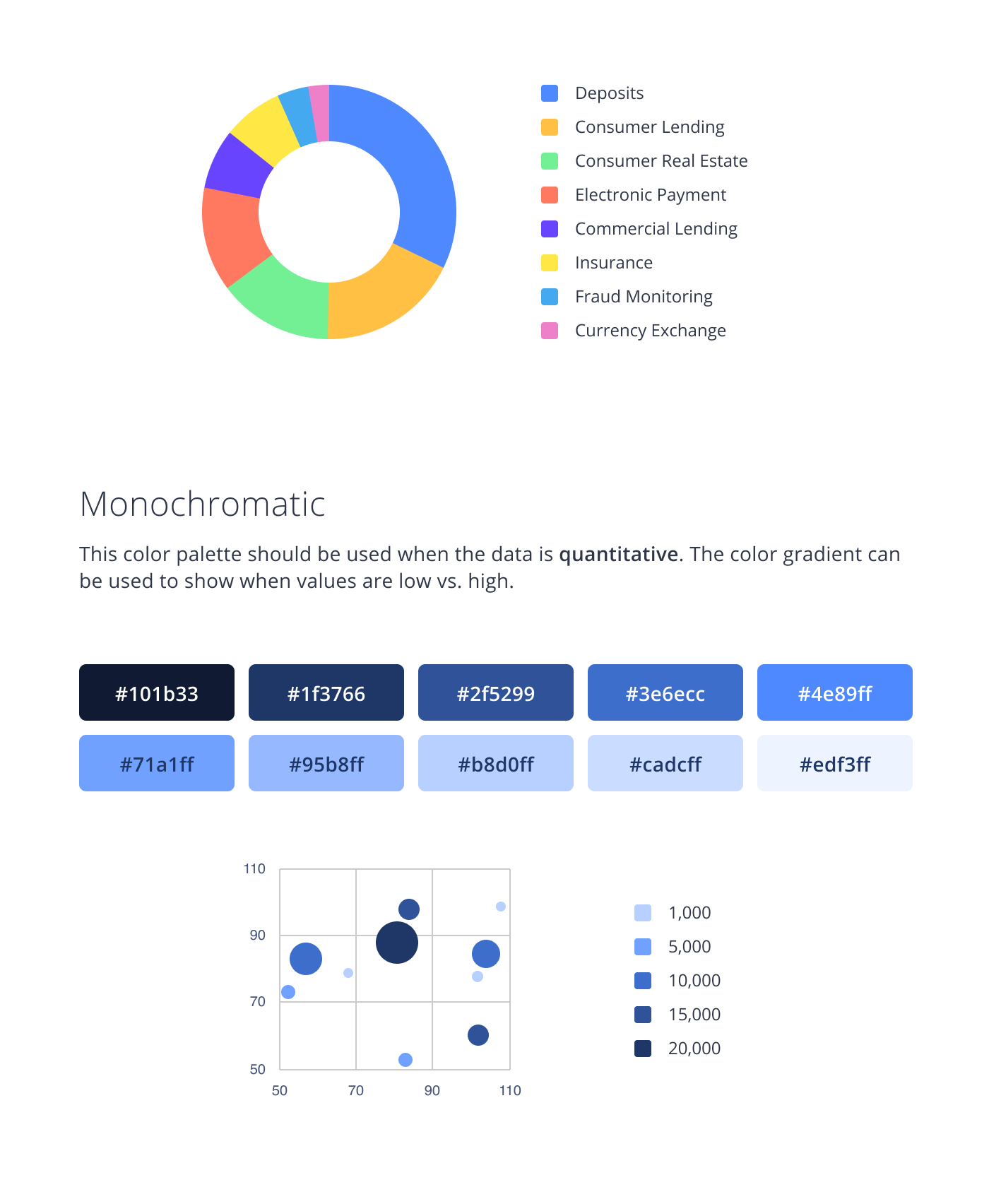
| My original attempt at documenting Data Visualization color palettes in Figma
Design and Development, unite!
Getting all this documentation in place is awesome, however, if it's only in the purview of Design, stuck within Figma files, what good does it do? We needed to get Development involved.
Up to this point, when a developer was working on any UI for a card relating to feature work, they would either have to try to copy and paste the component from somewhere else in the codebase or build components from scratch. This created some pain points for both designers and developers such as:
✦ Inconsistency from one implementation to the next
✦ Increase in tech debt due to copy + pasting of code
✦ Delay of delivery of feature work due to the time spent during Design Reviews
Because of these pain points, developers were on board to get a common component library going. However, we knew resources would not be pulled from feature work that was needing to be delivered so we decided to incorporate it into our delivery process. We figured that if we could show leadership the value of how reusable components could solve the pain points we were feeling, we could possibly secure resourcing towards it later.
| A selection of Nstyle icons
The evolution of our component library
A couple of our developers ran with the idea and decided to take the lead on building out our "Common UI" library. It was really exciting to have this become a real thing and have the components that were in there be used within our products. We were seeing the value we were hoping to see from our efforts!
However, over time we were hearing feedback here and there from other developers that it was very difficult and confusing to contribute to the library so only the ones that worked on the effort knew how to contribute to it. So after some time, I collaborated with our Director of Design to craft some questions for a survey we could send out to our Development team to gather feedback in a more official capacity.
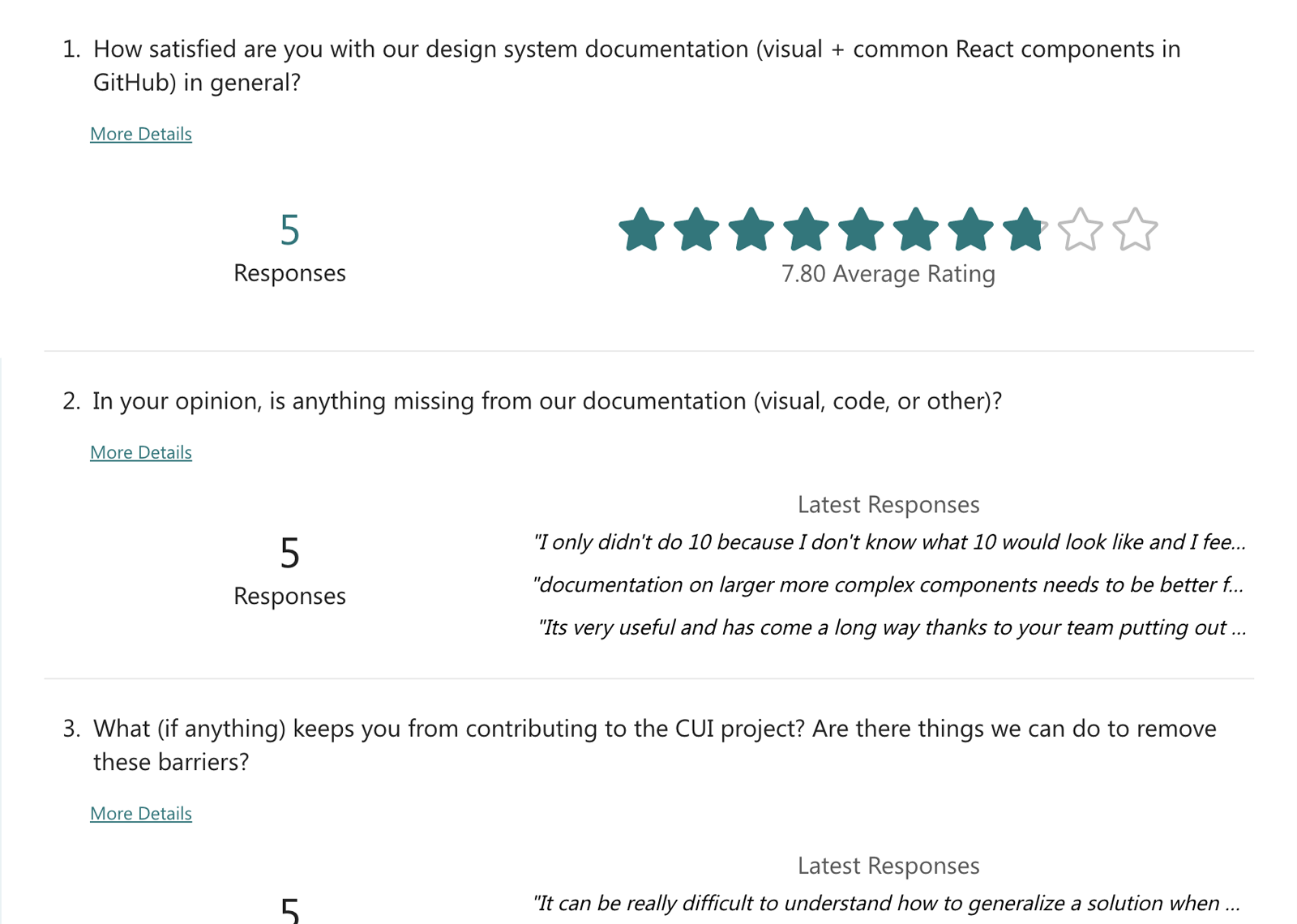
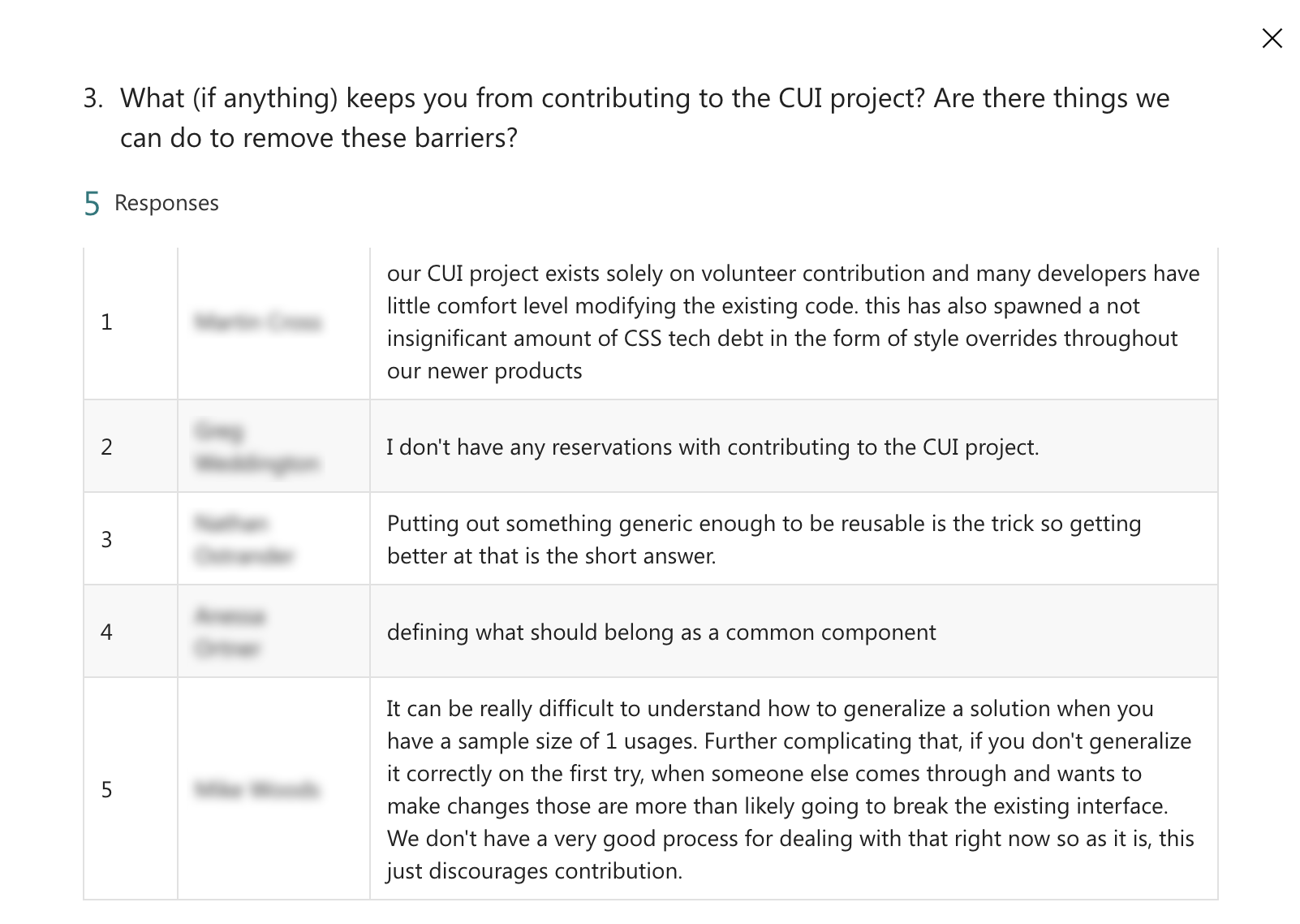

| A few excerpts from the survey
Although we didn't get the most engagement with the survey, we did feel we got enough to form a productive discussion around the pain points at hand. On the survey, we asked whether the survey participants would be interested in participating in a group feedback session where we discuss their feedback more deeply and everyone expressed interest. Prior to the meeting, I grouped the feedback into themes on a MURAL board so we could have the most effective meeting possible.
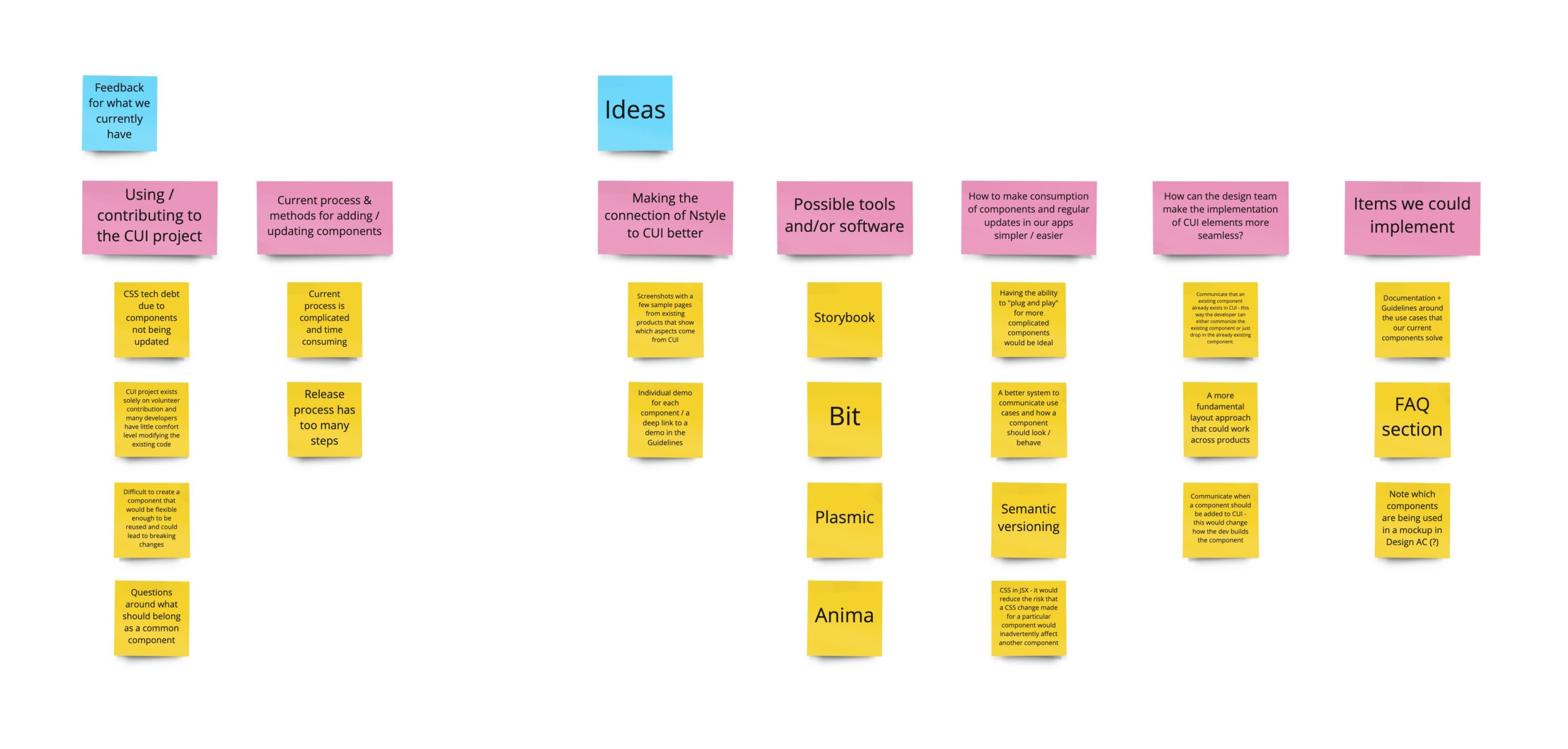
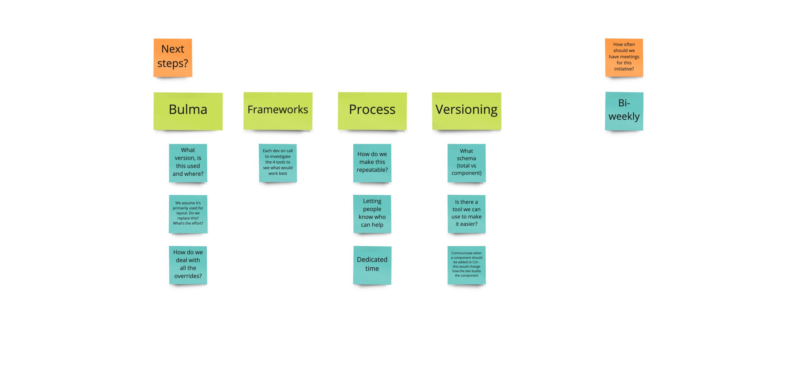
| Board from our Nstyle / Common UI Survey Feedback meeting
After the meeting, we established a regular cadence of meeting bi-weekly to address the next steps we had outlined. Over the next few meetings, we decided that Common UI was not a scalable solution and we would move to building out a new library in Storybook. This proved to be the right move not only because it would prove to solve the pain points developers were having but I also figured out that it is the preferred tool of companies like IBM, Salesforce and NASA for their component libraries (need I say more?)
Taking our documentation to the next level
After I had work on the V1 of our documentation and what it should cover and designers and developers were referencing it more and more to find the answers they needed. However, we were hearing feedback that although they could navigate to a particular component and read how and when to use it, they didn't have the context to be able to choose between 2 or more related components or patterns. Questions like "how do I know which Badge style to use?" or "When should a delete confirmation message be implemented?"
I was tasked to create a solution for how we might answer these types of questions in our documentation. First, I started by gathering together what common questions designers and developers have asked over time that would make sense to address in this format. This information came from notes either I or other Designers had or things that were top of mind.
Next, I chose one decision tree to create initially so that we could do a pilot study. I curated a list of 10 developers who I would send a survey to make sure we tested with a good range of developers who were newer to the company and less familiar with Nstyle vs those who had a longer tenure, senior vs mid-level vs junior. I then created the prompt and questions for the test, got feedback on it, made updates to it and then sent it on its way and awaited the results to come in!
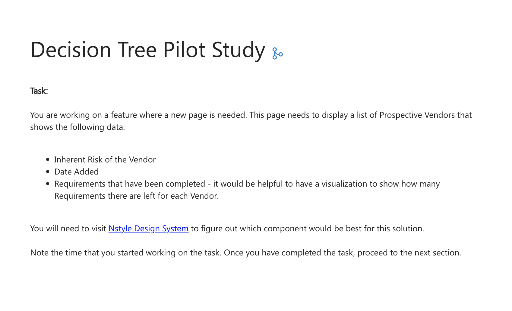
| Decision Tree Pilot Study prompt and excerpt of results
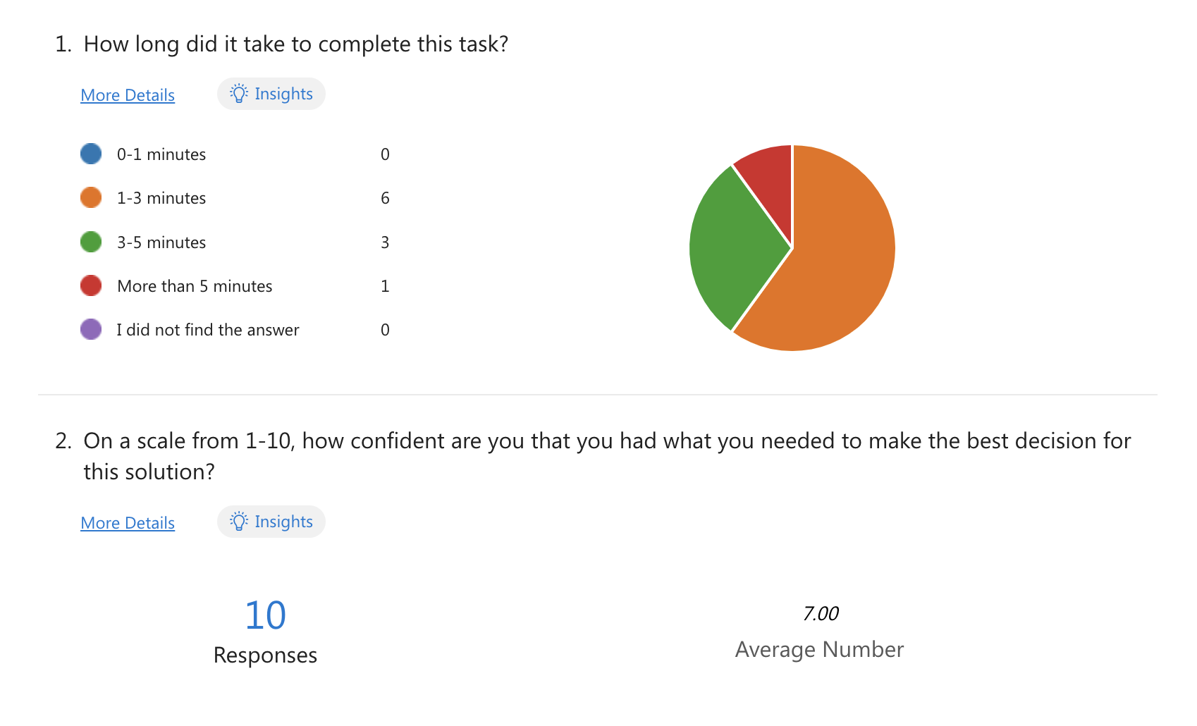
Overall, the results of the study showed positive results:
✦ 60% were able to complete the task in 1-3 minutes
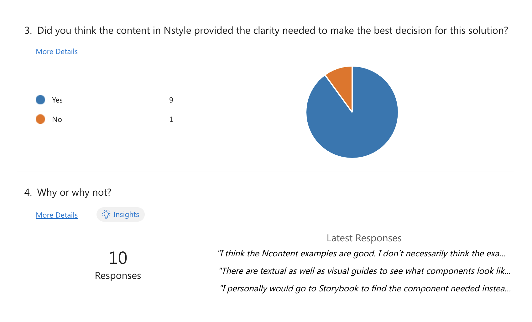
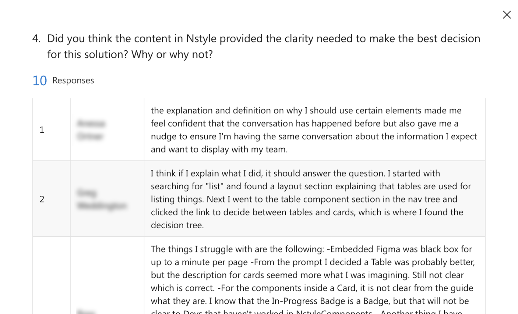
✦ 9 out of 10 felt the content in Nstyle provided the clarity needed to make the best decision for the solution
✦ The average confidence level that they had what they needed to make the best decision was 7 out of 10.
Because the validation was there that the Decision Tree were helpful, I continued to knock out the additional ones from the curated list.
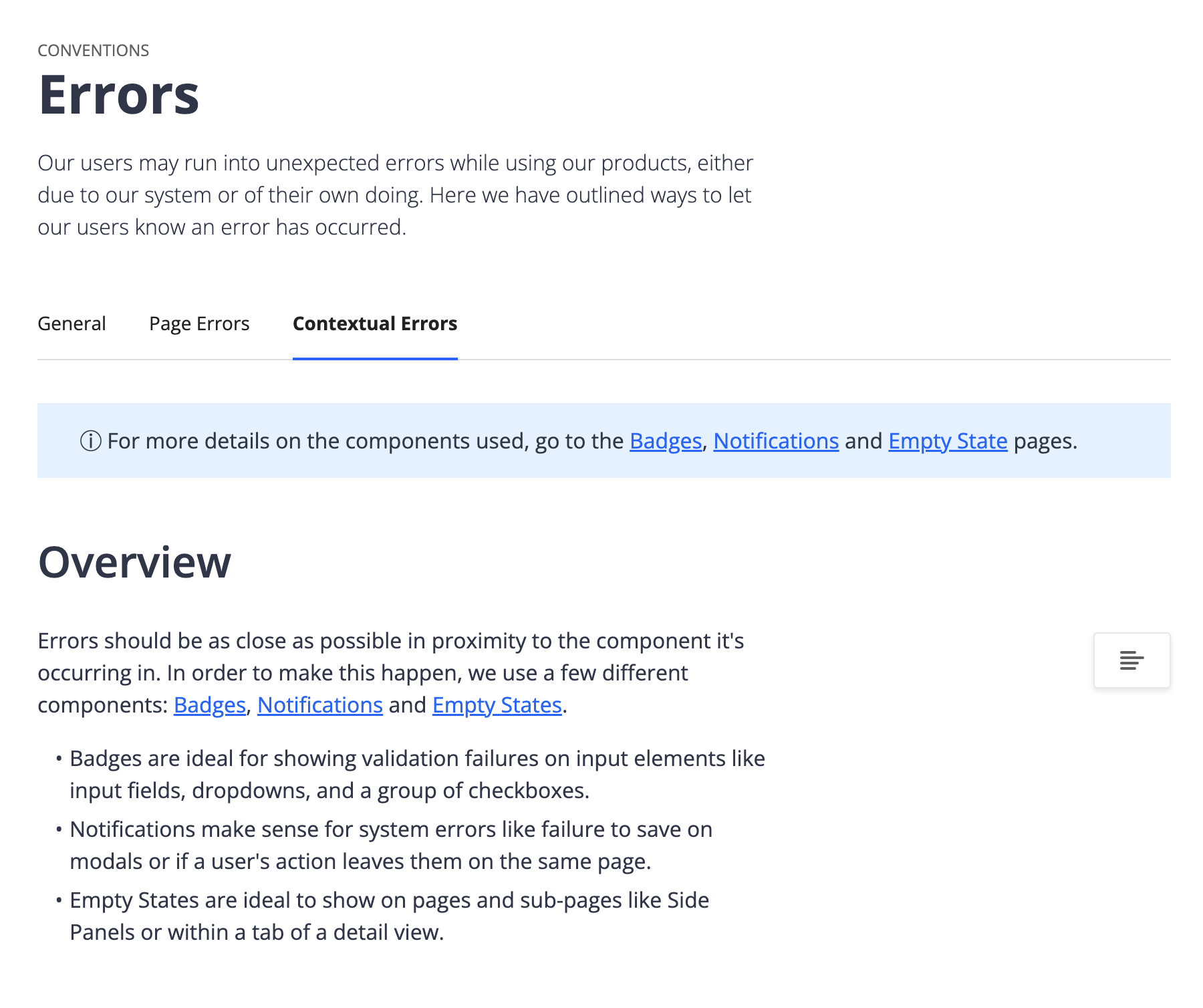
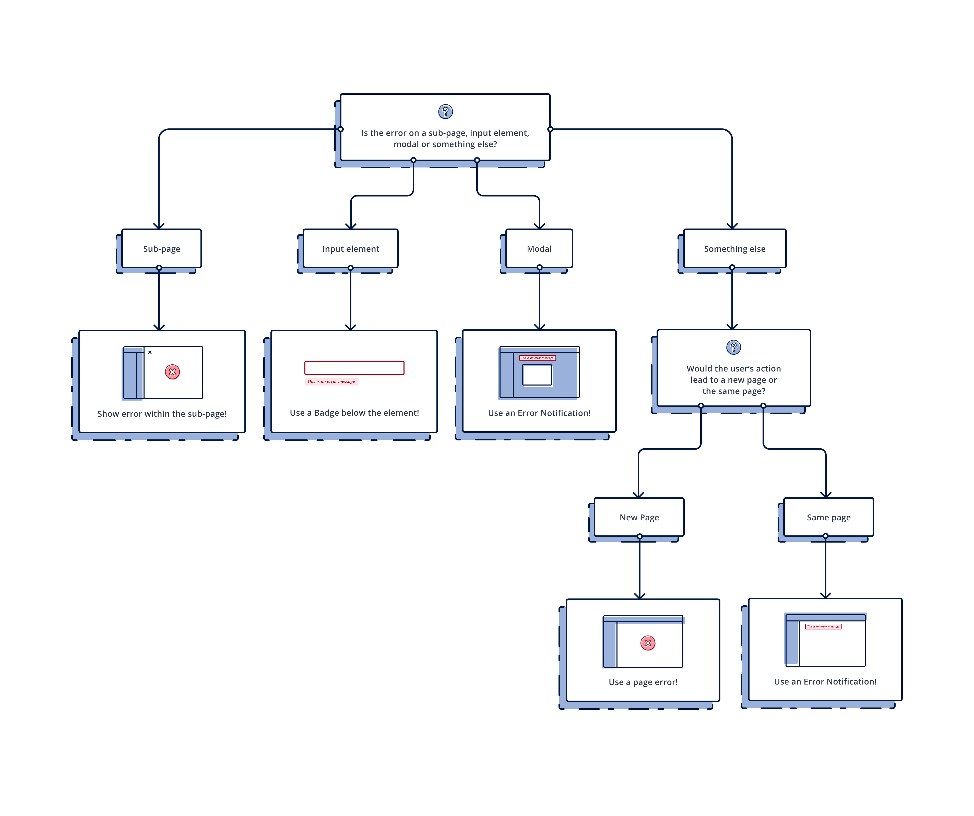
| Contextual Error Decision Tree
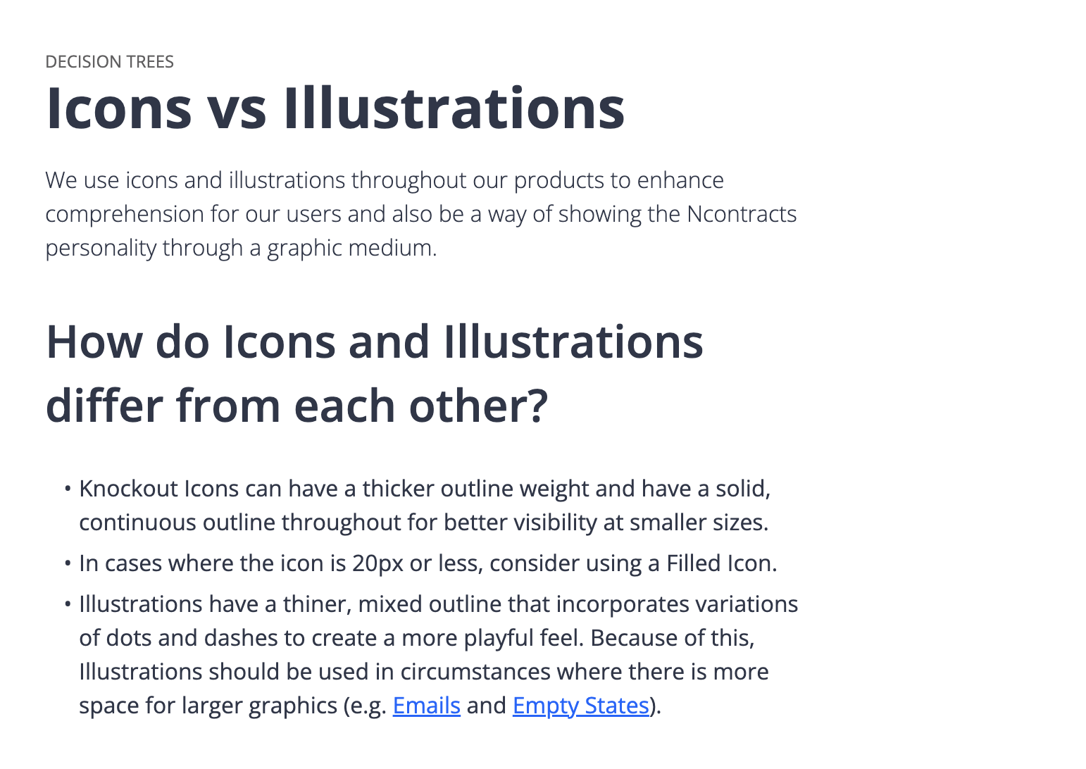
| Icons vs Illustrations Decision Tree
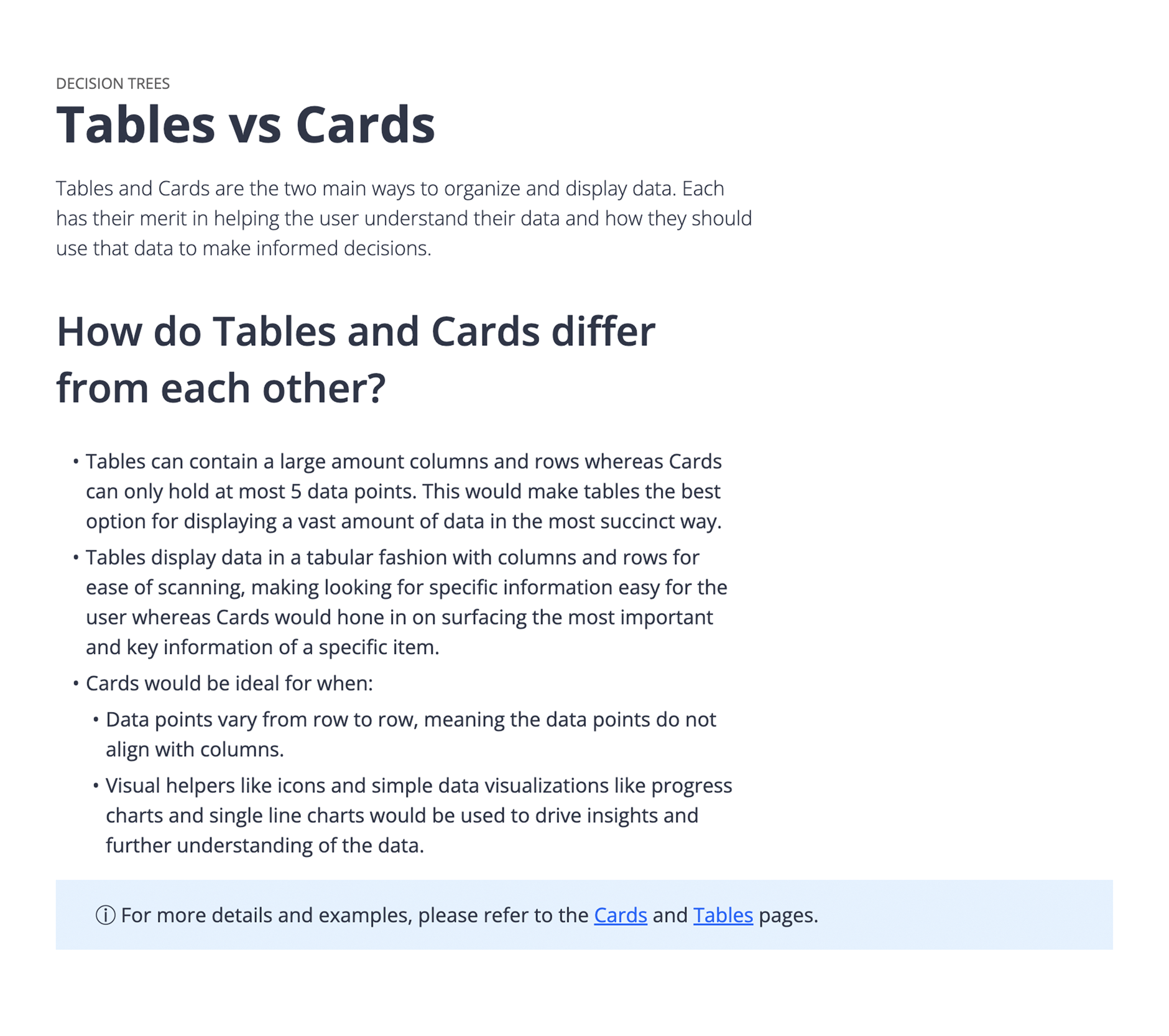
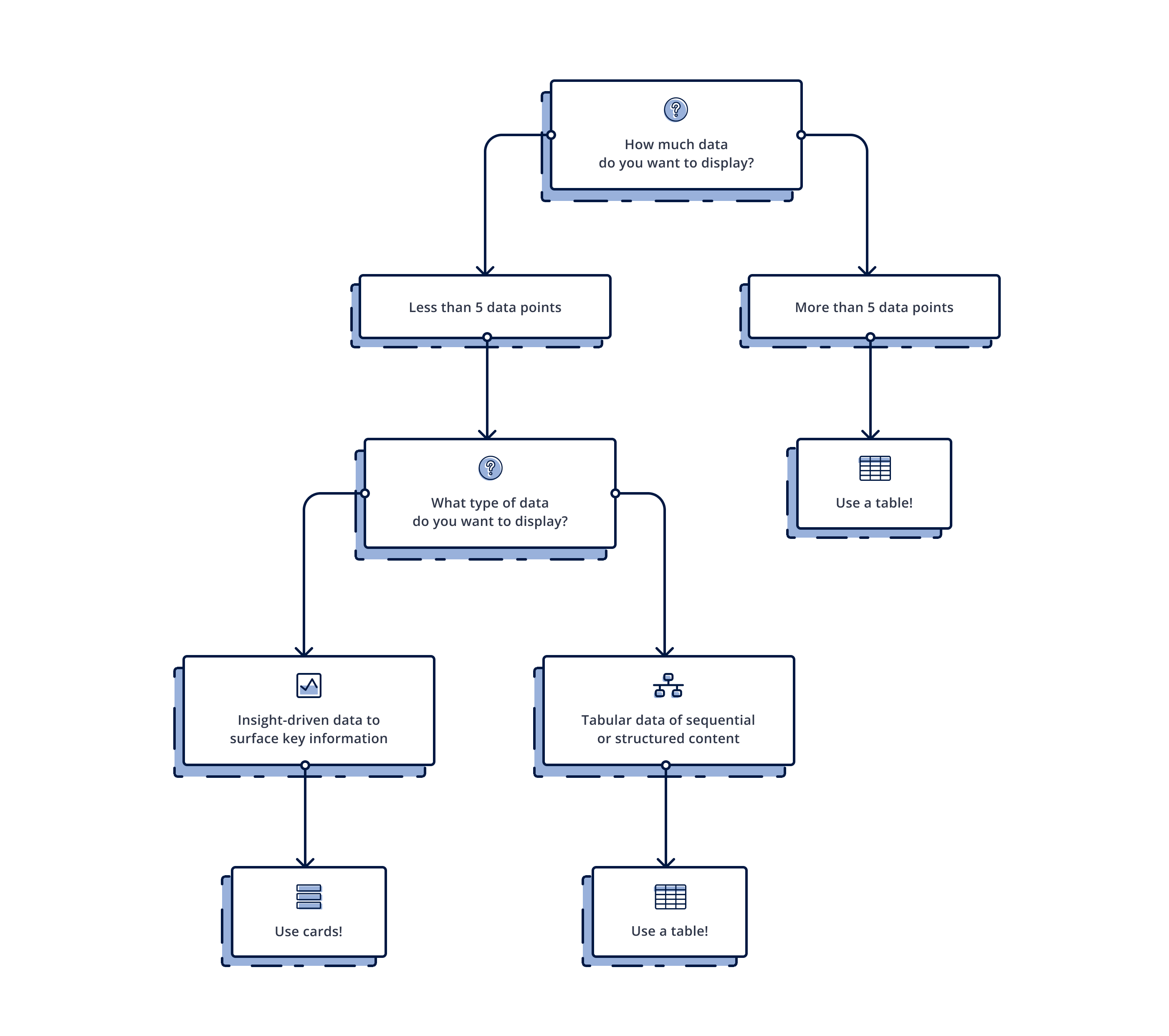
| Tables vs Cards Decision Tree
But even more than that, there were valuable takeaways related to Nstyle in general. A few of them were:
✦ Add dedicated documentation for common layouts that exist within our products (this was already on the roadmap but it validated that we should definitely have it)
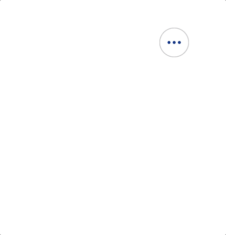
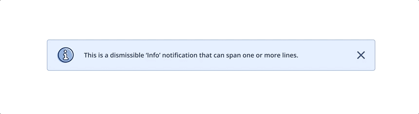
✦ Keep using info banners to direct people to Decision Tree pages
✦ Educate our designers and developers around nomenclature for components and use them as key words so they can be searched on easily
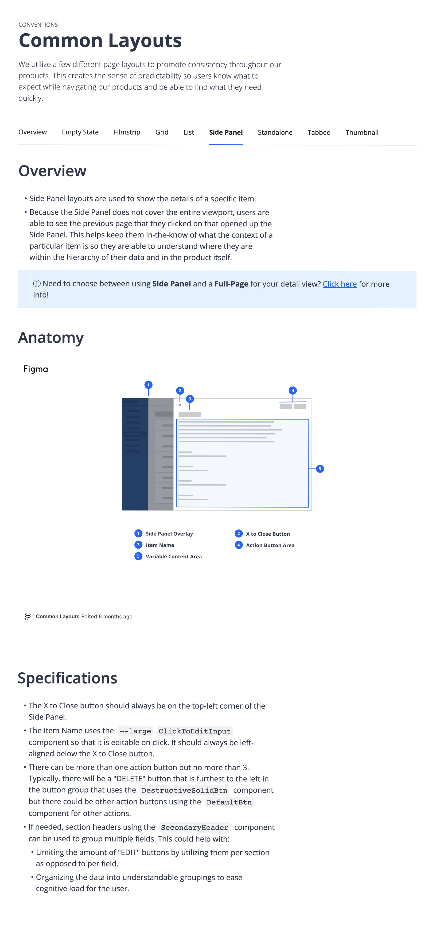
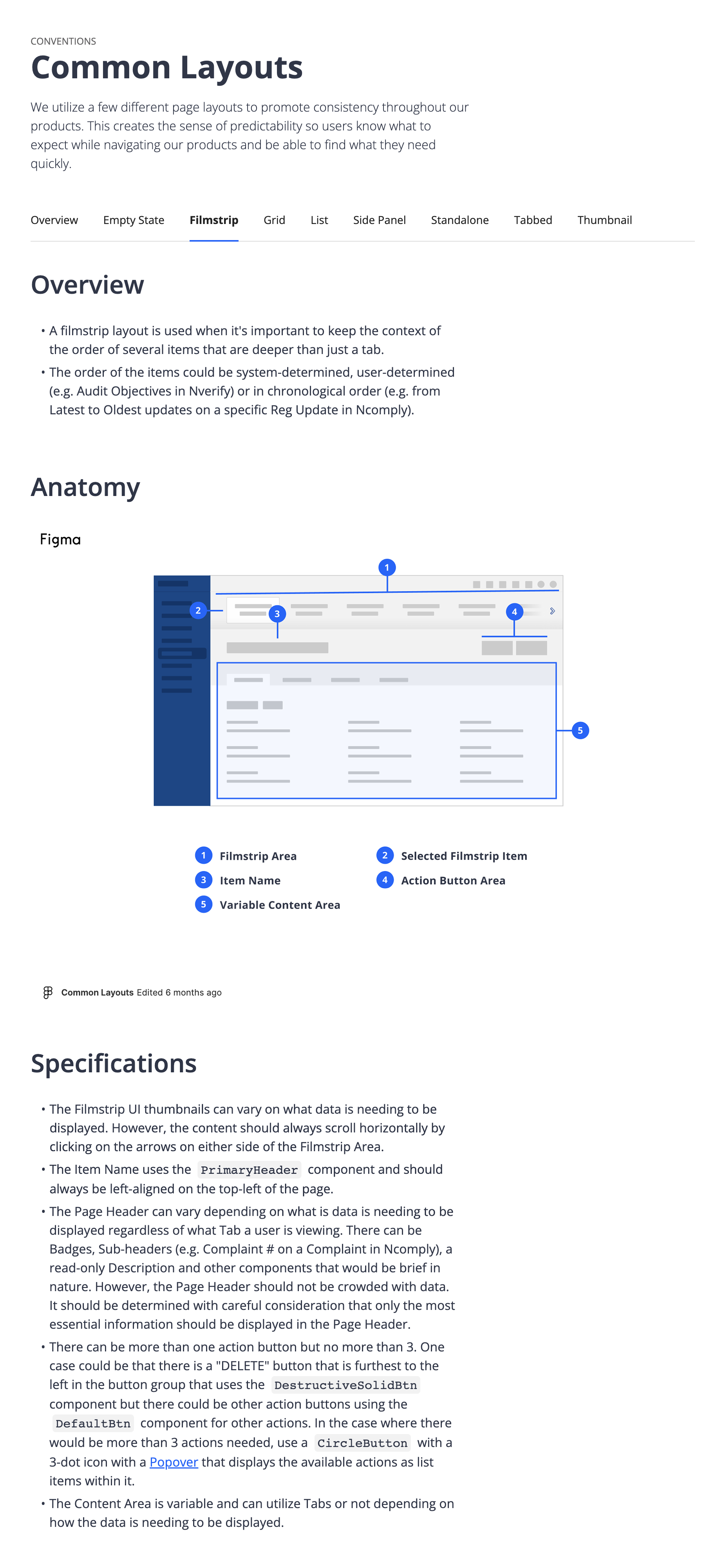
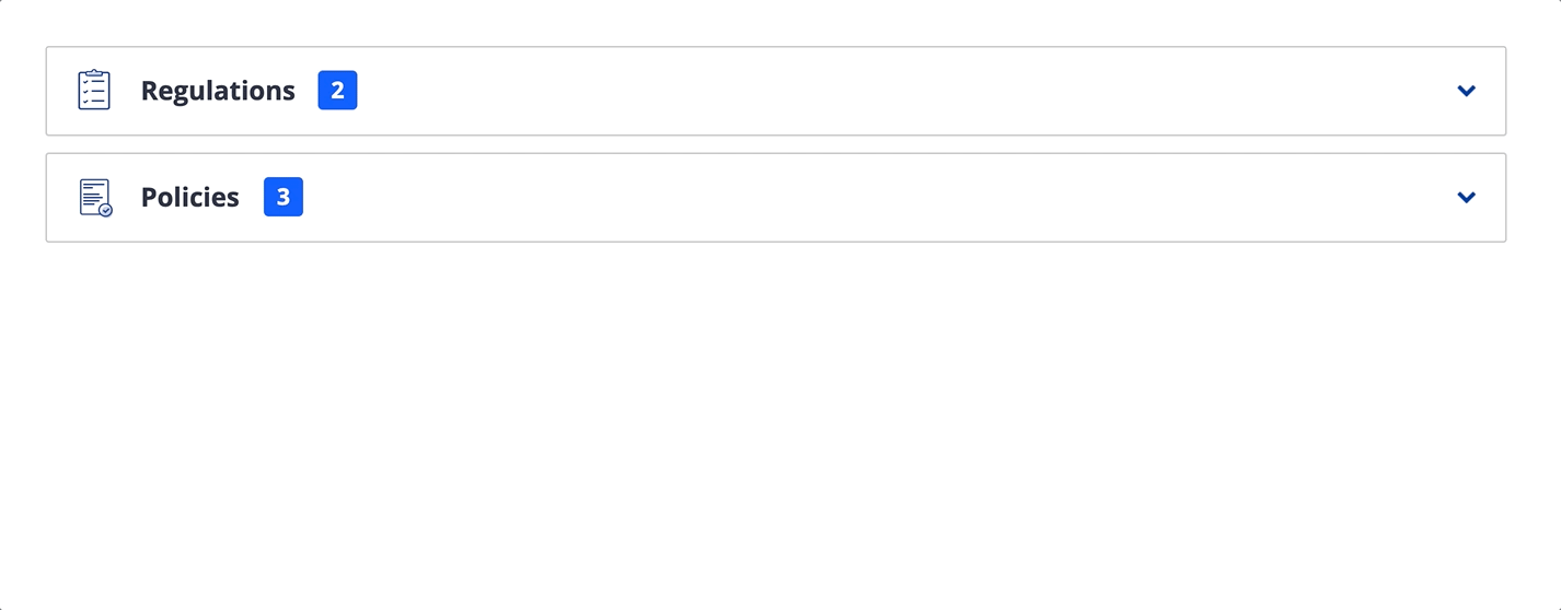
| Excerpts of the Common Layout documentation
Looking forward
It has been quite an exciting journey to build Nstyle from the ground up. There's a lot of work that has been done yet there are more things I am looking forward to exploring and implementing:
✦ Collaborating with development on design tokens for colors, spacing, typography, etc.
✦ Enhancing our UI kit to have every component using auto layout (only some do at the moment)
✦ Figuring out best way to measure the effectiveness of our current components and patterns in order to make informed decisions for improvements
Also getting positive feedback along the way is not too shabby! 
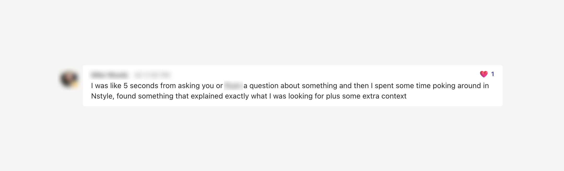
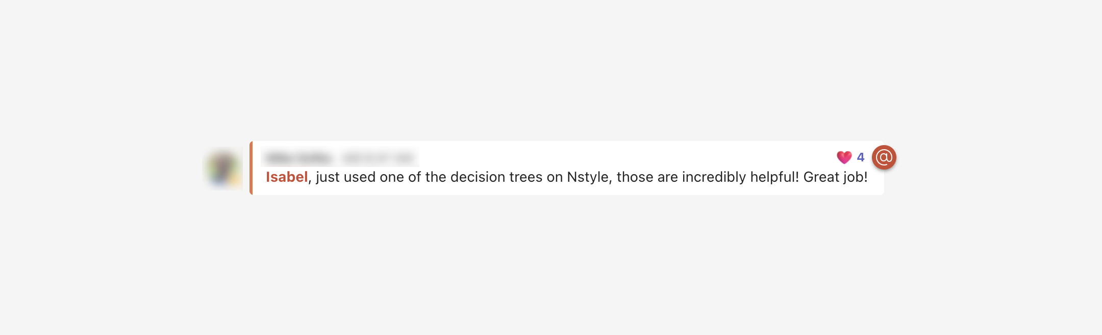
| Feedback from team members about Nstyle
ⓒ morning blues design 5eva