
Creating the initial dashboard for Nconnect, a Compliance Engagement Platform
TL;DR
✦ I solidified what widgets would be included for the dashboard MVP from concept to UI design based on prior research the team had already done before I joined the effort.
✦ I incorporated my knowledge of current user pain points to solve for those additional use cases for the non-intranet related widgets, specifically Action Items and Recent Activity.
Thrown into the mix
By the time I had joined the Nconnect vertical, the team had already been established for a few months prior while I had been working on other feature efforts. I was resourced into the team because they had a ton to do from a design standpoint. Luckily, the Design Lead and I had already been chatting frequently about what work had been done so far so I did not feel totally unprepared to jump in and help out with whatever they needed.
Nconnect was poised to go further than our other intranet products that the company had acquired. It was established that the Nconnect MVP would retain some traditional intranet functionality to appease customers of our intranet products while appealing to customers of our risk and compliance products by introducing concepts that would integrate content from those products into one platform.
My task: defining and designing Dashboard widgets
The Design Lead had already created vague wireframes (think empty boxes on a page with some labels) for the general areas that needed to be addressed. Between me, the Design Lead and our Director of Design, we decided that I should work on the main dashboard and figure out the widgets that would be on the page. The decision was made because I was seen as the most well-positioned to create widgets that would family in nicely with our design system because we'd be using mostly existing components. I was also tasked with being the lead on this effort so I would be needing to make proposals and decisions quickly and effectively which I found very exciting!
I proceeded to get my hands on all the prior research and resources that I could get my hands on ranging from research papers from Neilson Norman Group and Gartner Research to internal SME interviews as well as the input from the Product and Design Leads in order to put together a proposal for the list of widgets that would make MVP.
| Brainstorming ideas for potential widgets
Once I had a list together, I wanted to get the Leads together to discuss the vision for each widget and what the feasibility for each would be to create a shared understanding and make sure everyone agreed these were going to be the widgets for MVP. I also created a first high-res pass of the dashboard to have a visual aid that would help guide the conversation.
| Messaging the team about the widget proposal meeting
| First high-res pass of the dashboard used as visual aid during the meeting
The meeting ended up going well and no one had any objections to any of the proposed widgets on the dashboard (direct quote from the Design Lead, "seems like everyone likes it!"). The main takeaway from the meeting was that the team wanted more clarity on what data points were going to feed into each widget and where they would be sourced from so because everyone felt good about the direction from a high-level, it was full steam ahead!
Diving into the widget details
I started writing out the different requirements I felt made sense for each of the widgets to make sure I had a handle on all the use cases that needed to be addressed with each, including use cases that are current pain points for our customers that could be solved through some of the widgets.
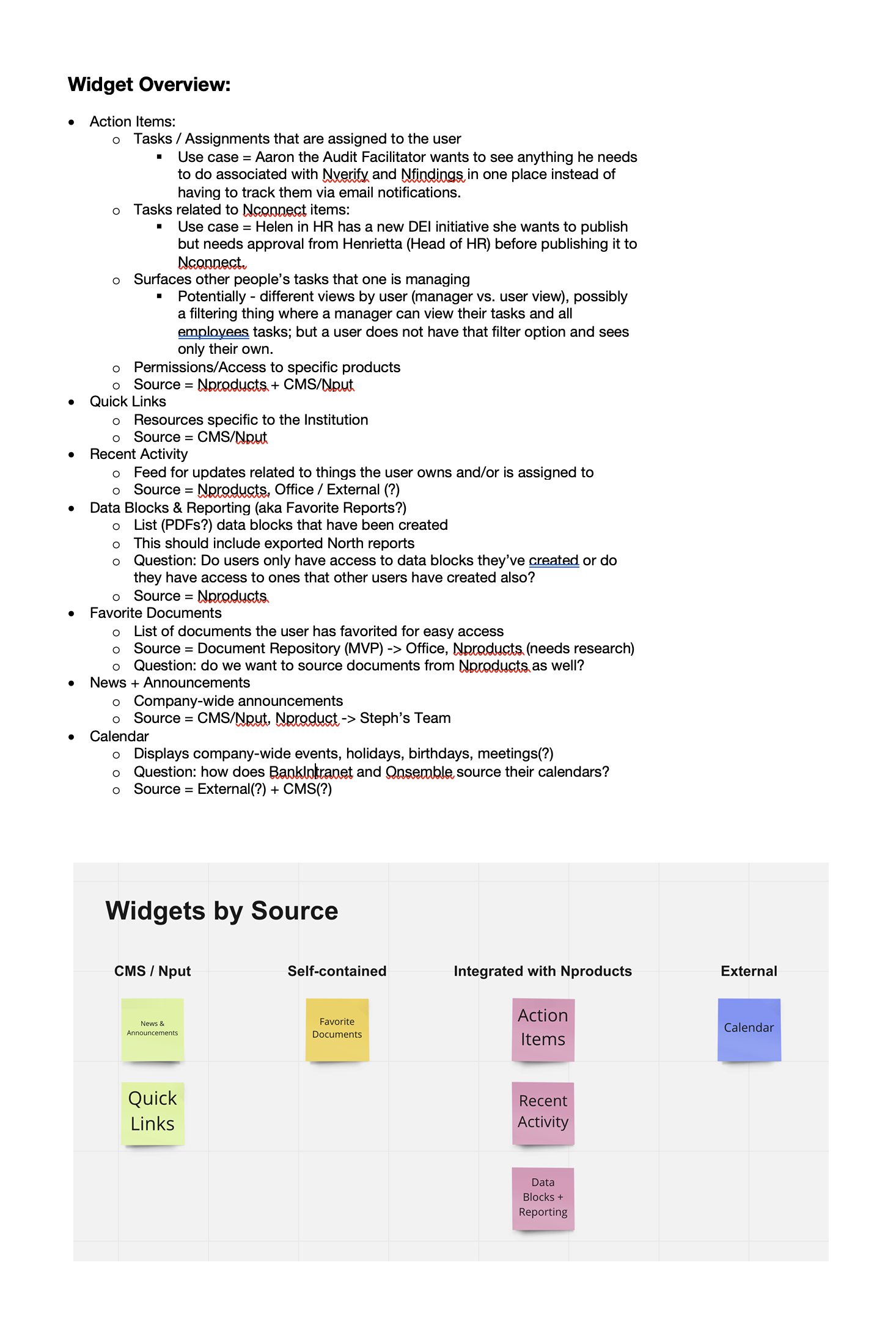
| Written outline of the widget details
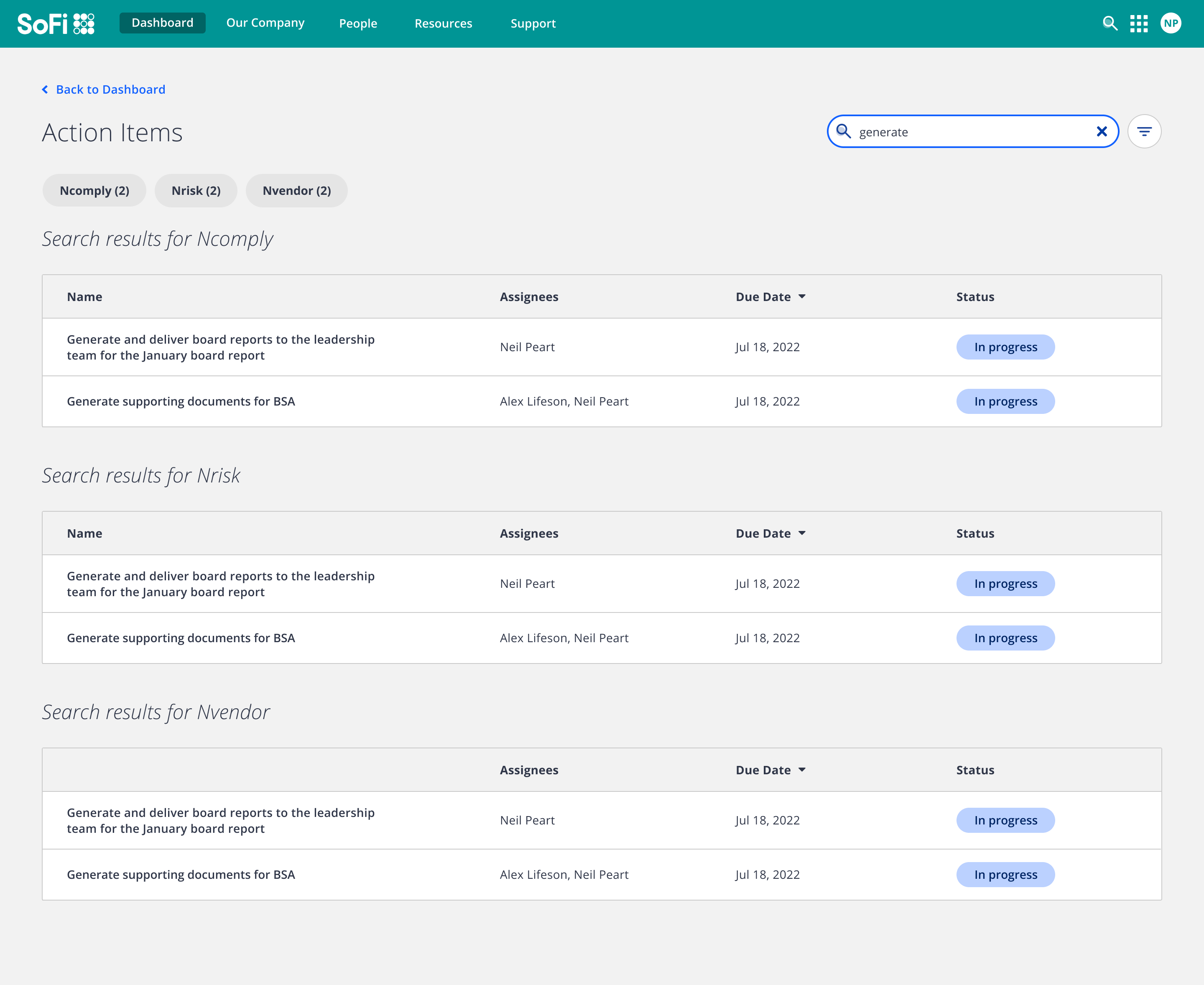
I started with the widget that I felt would be the most involved yet impactful, Action Items.
A current pain point for users is that they have to go to each product to view the respective tasks/assignments/to-do's that are related to that product so there have been discussions around creating one centralized task management system where users can view all of their tasks in one place. There have been attempts by other teams in the past to figure out what this would look like but this would be the opportunity to finally create that experience.
This would also be an opportunity to condense the nomenclature from 3 words / concepts that exist within the products to 'Action Items' which would create a pathway to feeding additional items that are needing action from the user and should be brought to a user's attention that are only currently being surfaced via email.
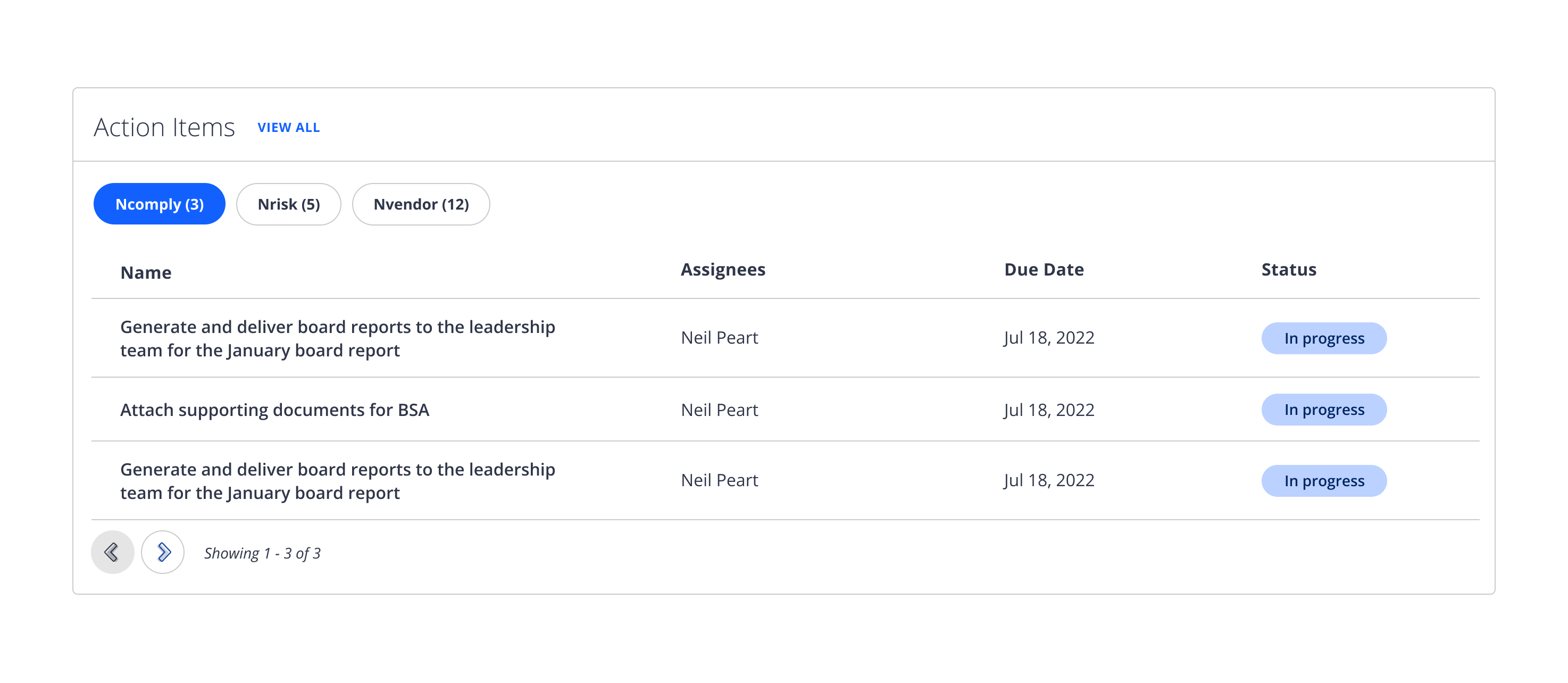
| Action Items widget
Planning for consolidating the different types of action items that would need to be surfaced within the widget was a challenge! At first, I thought it would be possible to figure out what the common data points for each type of action item would be surfaced in one tabular view. However, while digging deeper, I realized that every task/assignment/to-do to do currently in our products does not have much in common:
✦ Each has different important dates (most don't even have due dates which was a little surprising)
✦ Each type has important context necessary for the user to see so they know what the thing is
So because of this, I wanted to have a way where I could both surface the pertinent info for each action item in their own tabular view but not have to create a major visual context switch within the UI as much as possible.
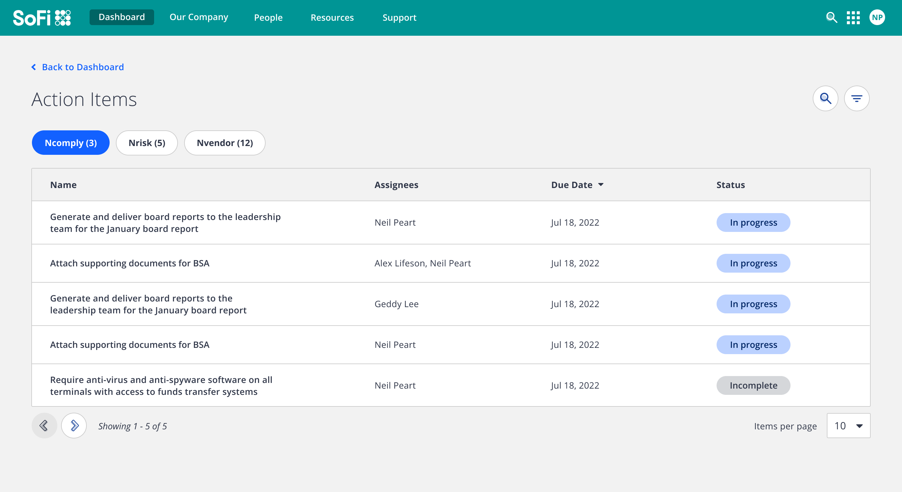

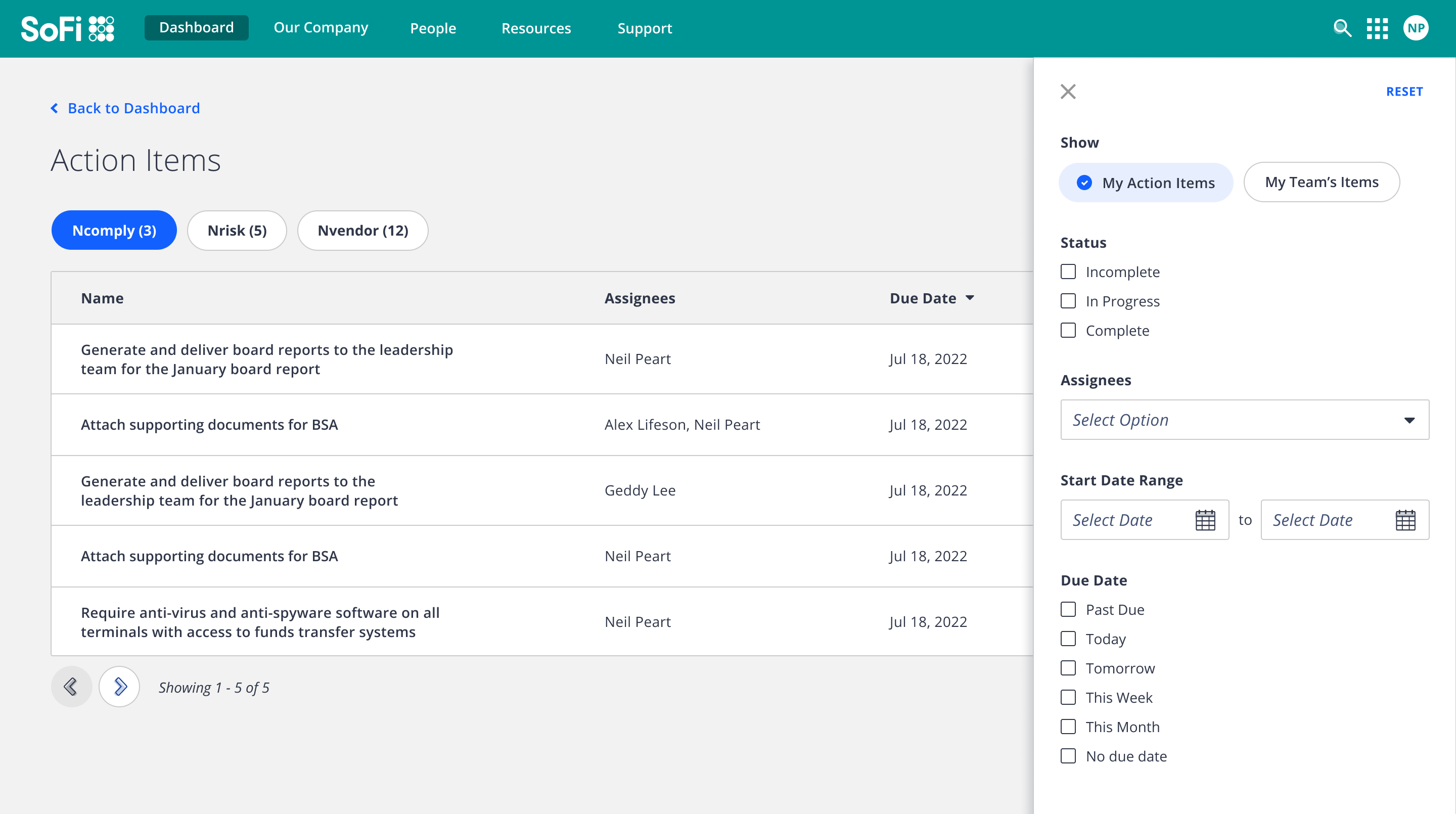
| Action Items 'View All' detail view
The next widget I tackled was Recent Activity. One of the pain points that current users have is that they receive a lot of emails from our system. Because of this, I felt this widget would be valuable in solving that pain point by surfacing the information from those emails in one place. I also saw this as the precursor to in-app notifications as that is not a concept that exists in our products.
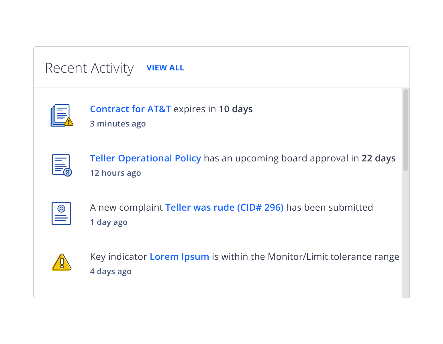
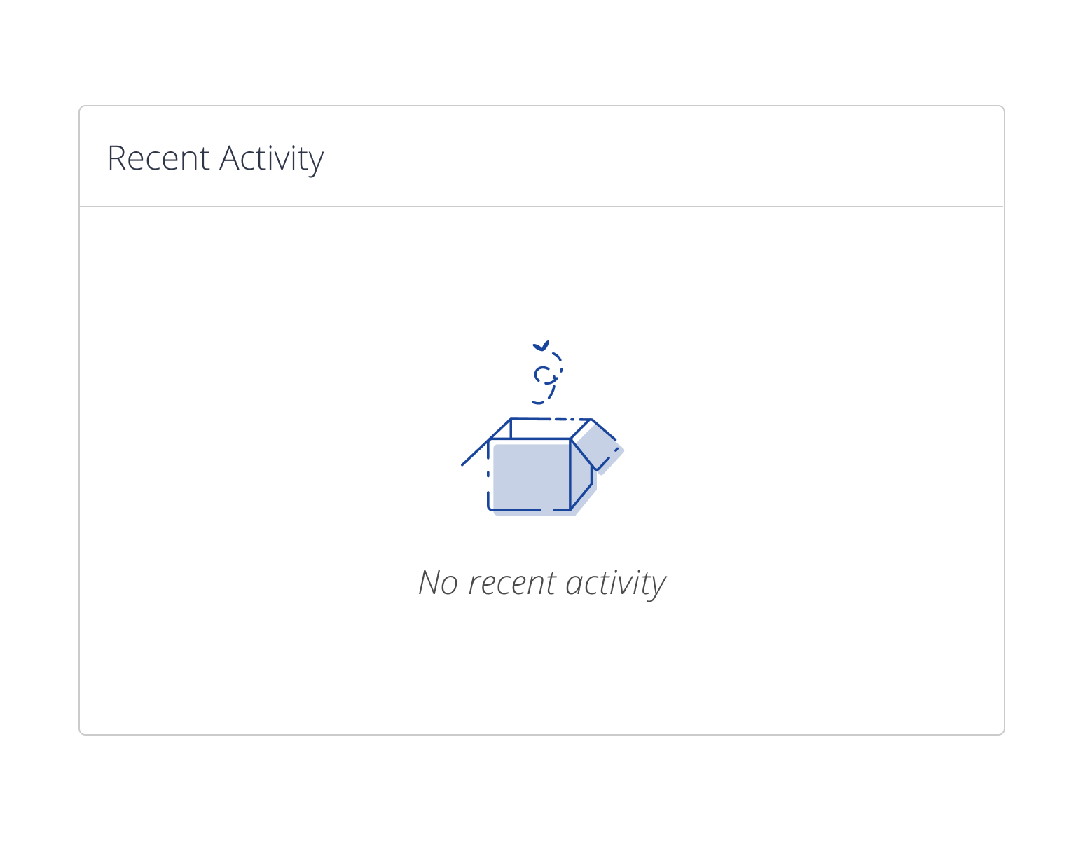
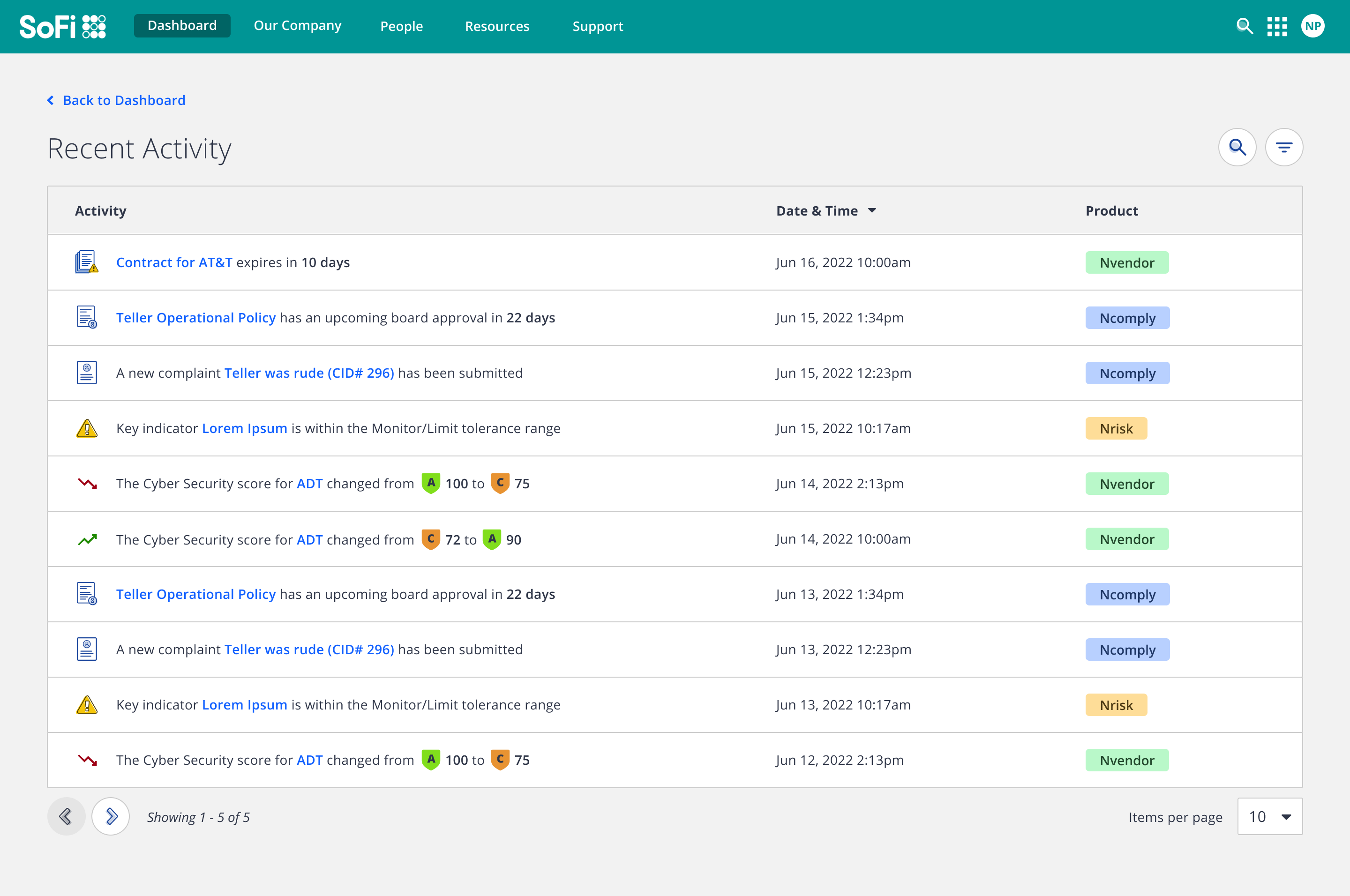
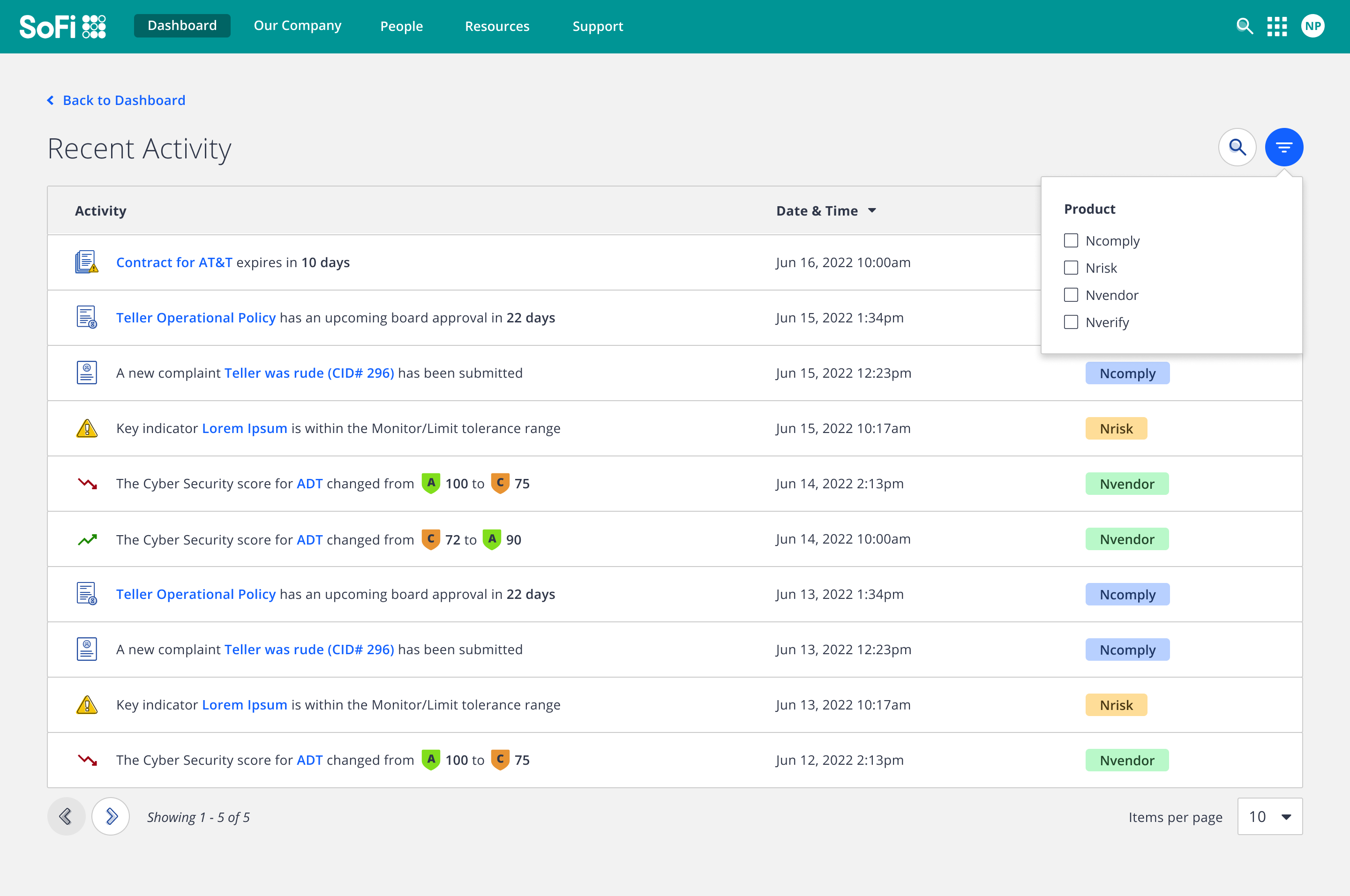
| Recent Activity widget + 'View All' detail view
The widget that had a bit of iterations between the initial widget proposal was Events (formally known as Calendar).
For the Events widget, my initial thought was to use our date picker component so that users could select the date they wanted to view events for. However looking at examples of intranets in the NNg research, most seemed to have list views that were targeting the current week with a ‘View All’ button that would lead to a complete list of events in a detail view.
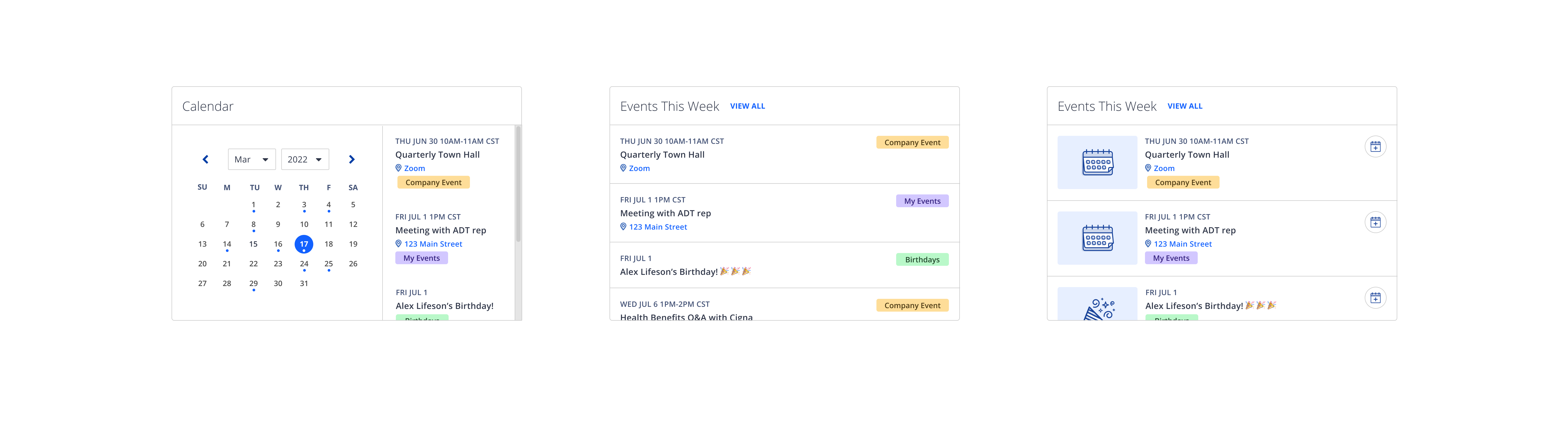
| Iterations of Events widget
This approach felt much more simple and clear from an interaction and UI standpoint as I figured a) our customers typically don’t have tens of events per day that would warrant viewing days separately, b) the cognitive load would be larger if the user had to select days individually and c) most would probably not take the time to view events that are months in advance so the date picker would probably be overkill (also a complete list view shows all the events anyway) so it made sense to change up the widget design to be more of a list view of the current week’s events with a corresponding view for all events. Also the addition of the ‘Add to Calendar’ button would have made the initial design even more crammed and busy so I believe it was a better choice.
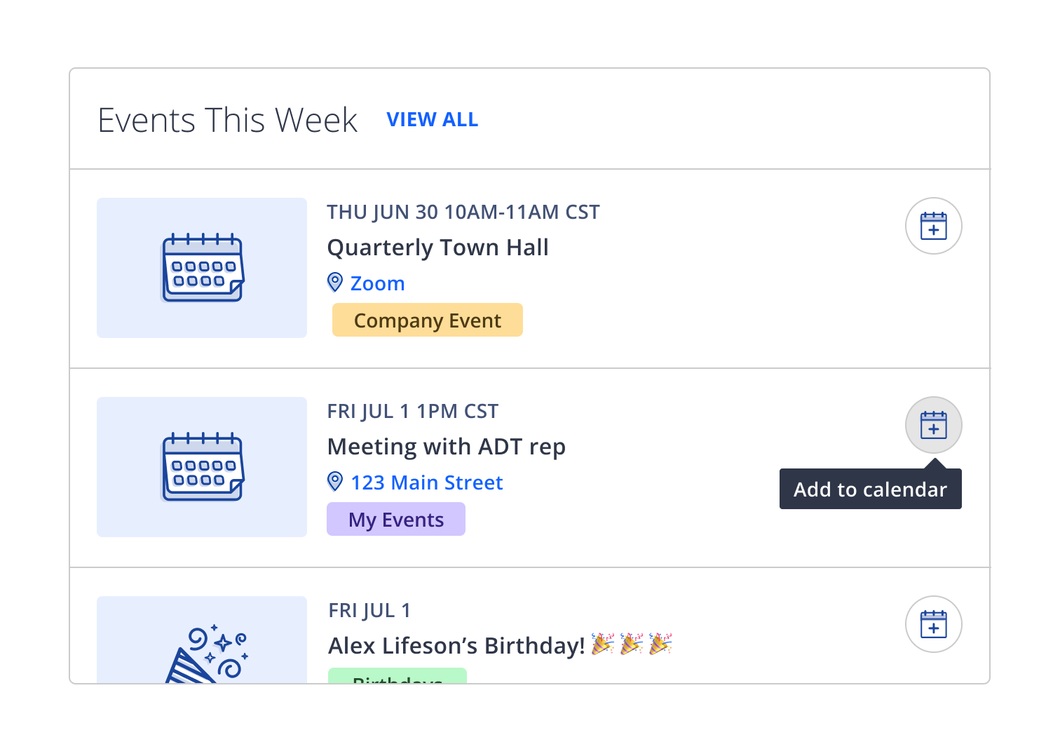
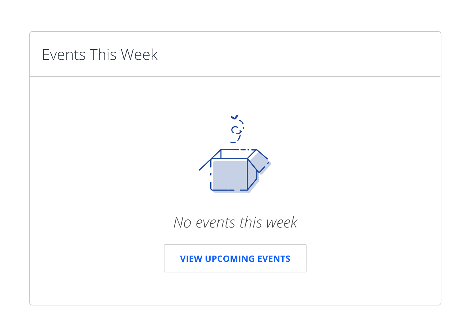
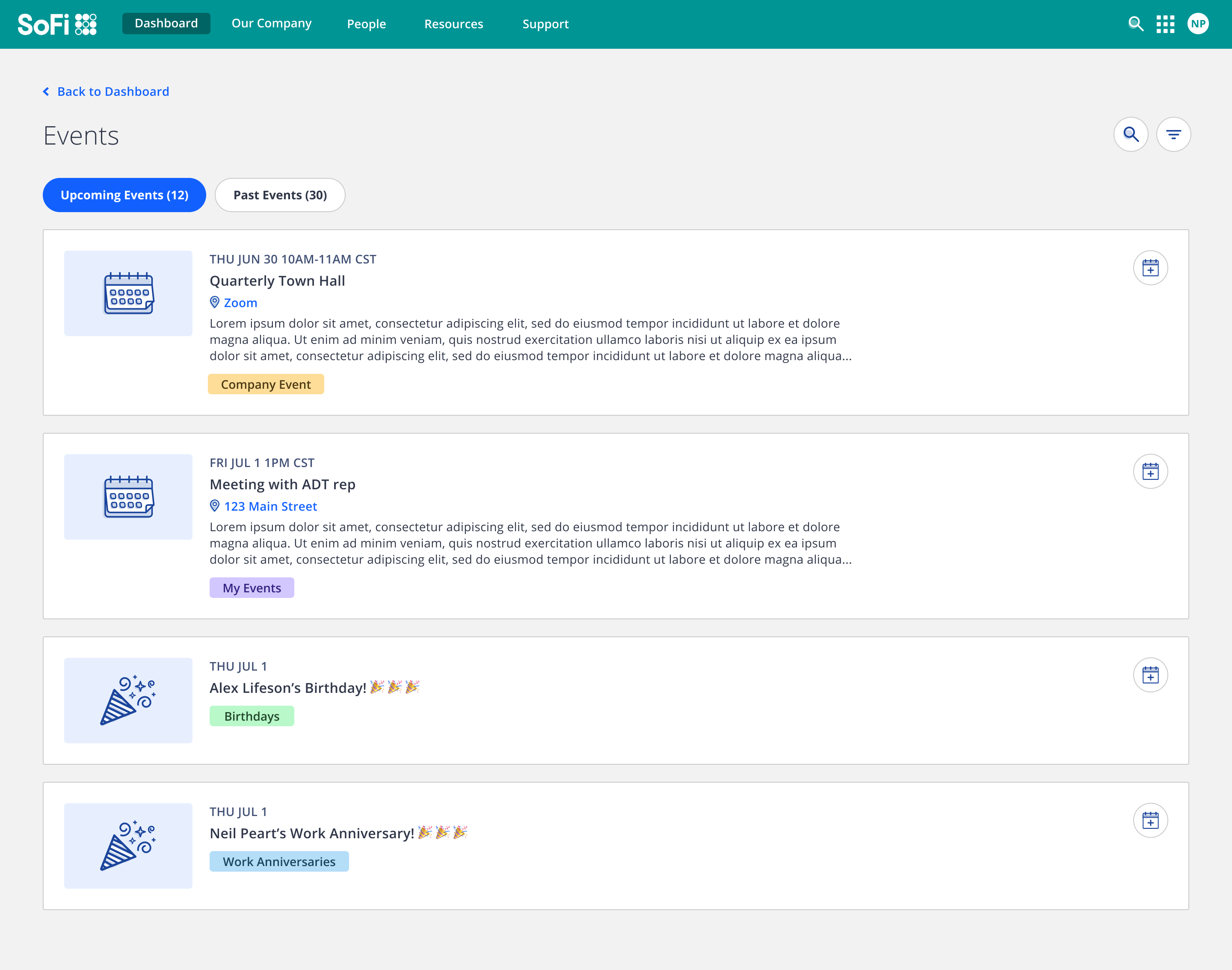

| Events widget + 'View All' detail view
For Quick Links, the initial ask was to mimic the same functionality as one of our other intranet products so it was initially very simple as it would have just been a list of links managed within the CMS part of the product, configured only by an Admin at the institution. However, when discussing it with the Product and Design Leads, we updated the requirements to have users be able to add their own links as well and also be able to rearrange them within the widget so I updated the design to incorporate the new functionality.
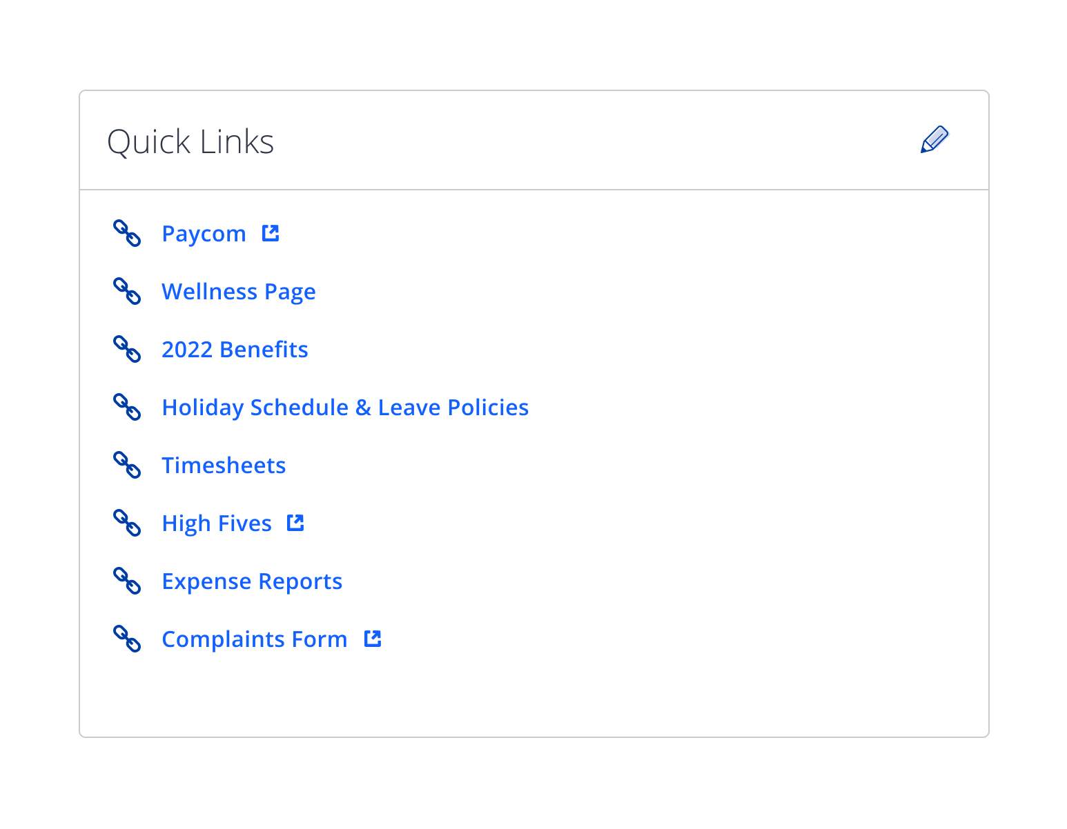
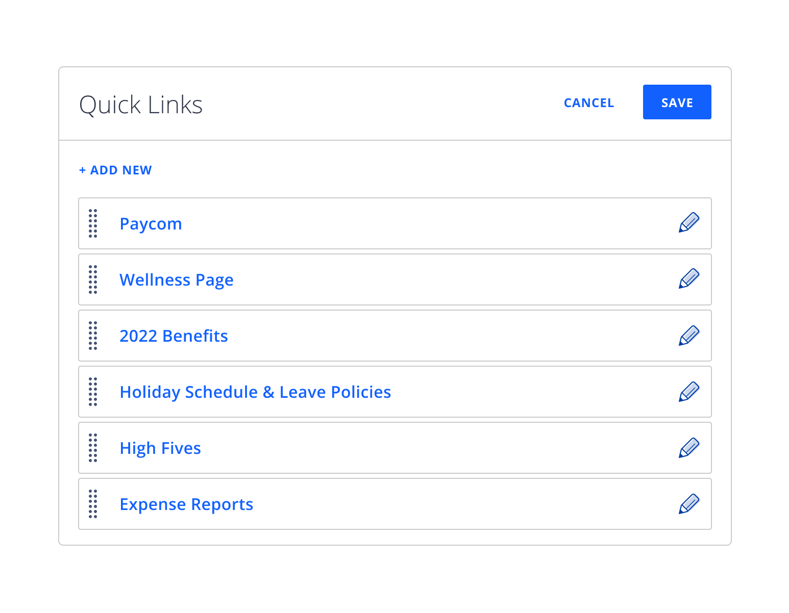
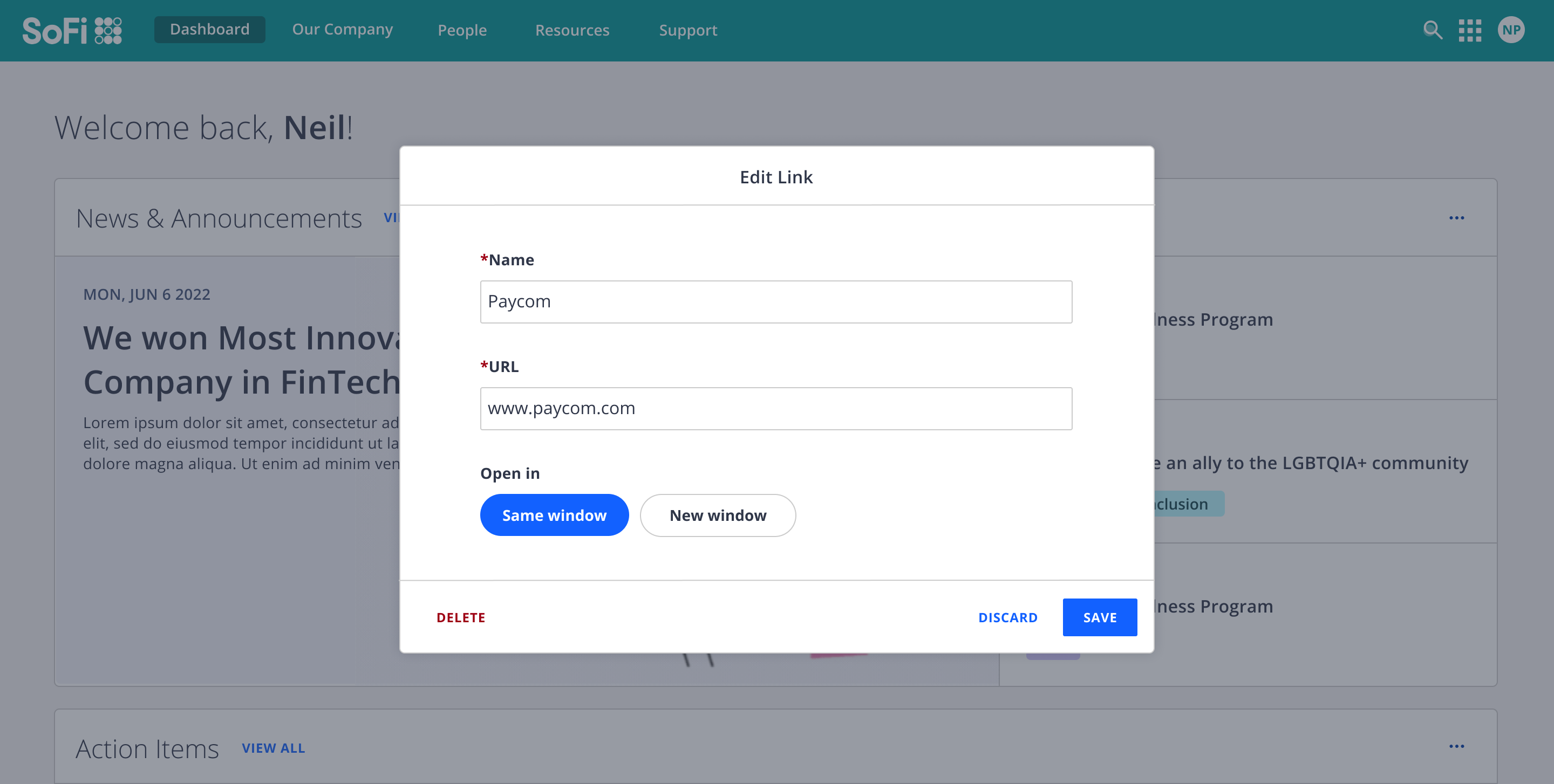
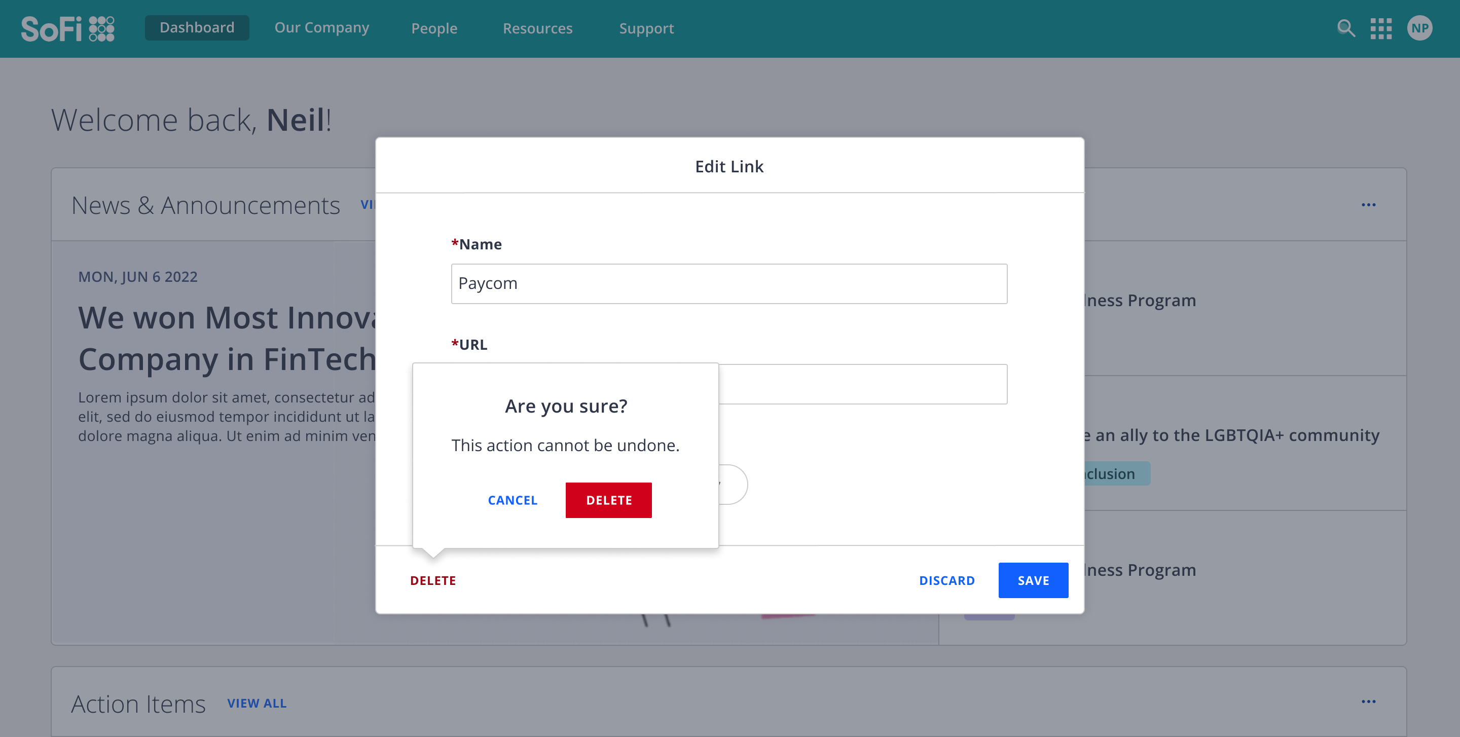
| Quick Links widget + add/edit configuration view
I was also asked by the Product Lead to brainstorm ways we might surface updates that have happened since a user's last login for the top section of the dashboard, this turned into the concept of Activity Roundup. I also explored a possible widget that would help launch the user to where they last were in our product:
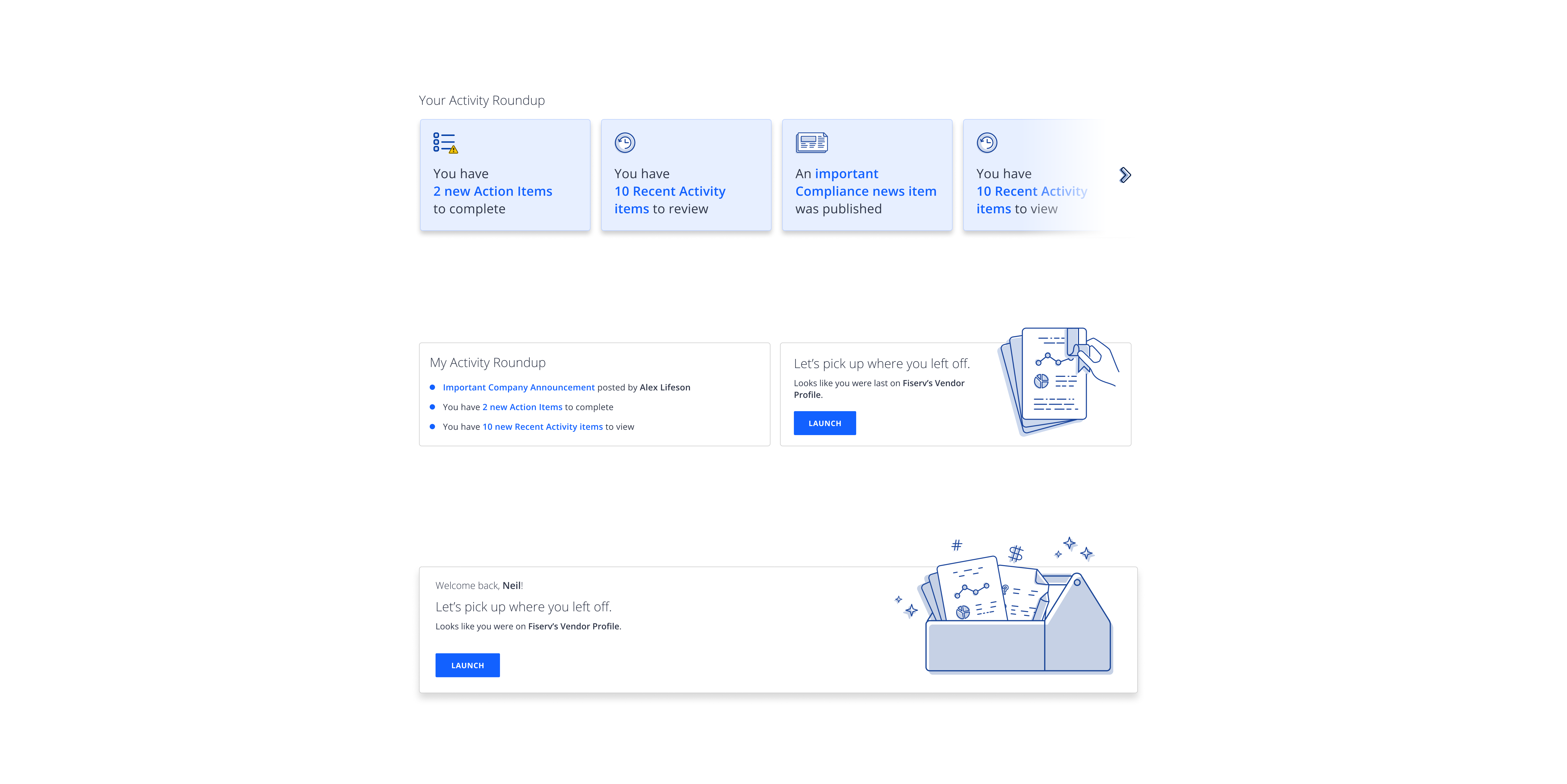
| Explorations of possible 'Activity Roundup' and 'Pick up where you left off' widgets
The key takeaway
Communicate early and often with every single key player: The Product Lead had their interpretation of what 'Recent Activity' meant and I had mine. Although a brief conversation got us aligned quickly after I saw the discrepancy and they were on board with what I had proposed, it happened later in the process than I would have liked. I was trying so hard to solidify the widgets that I did not check in as frequently with the Product Lead as I probably should have. I was always in close collaboration with the Design Lead but not as much with others while I was heads-down on figuring things out.
next project
ⓒ morning blues design 5eva